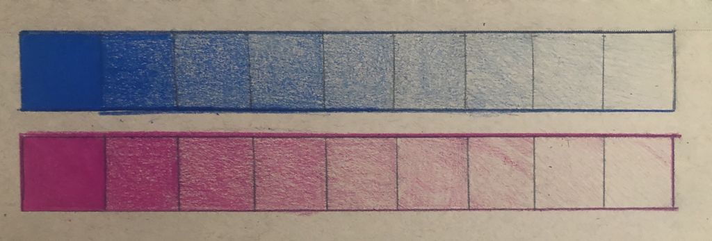
Value Chart
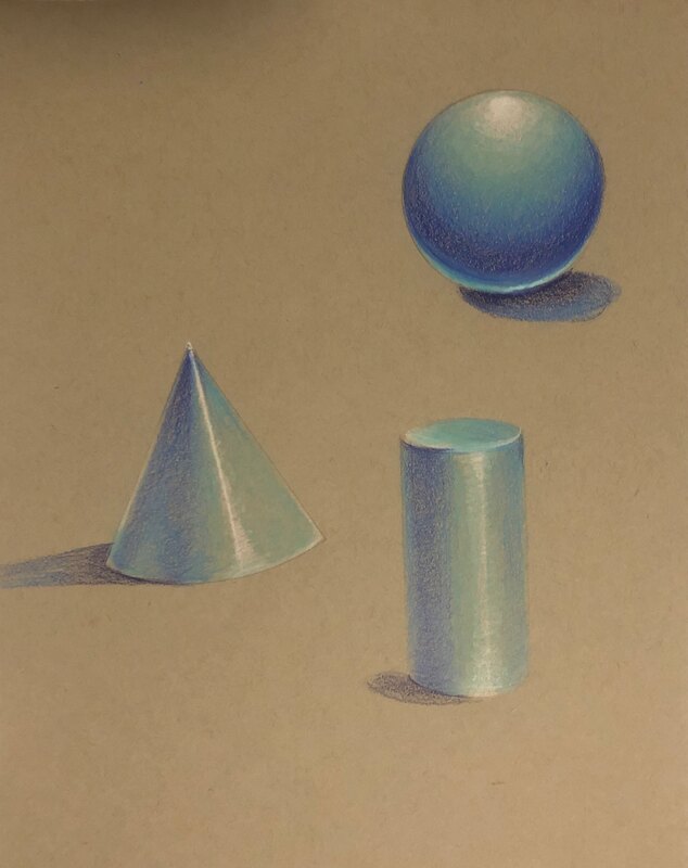
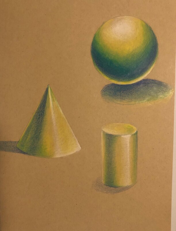
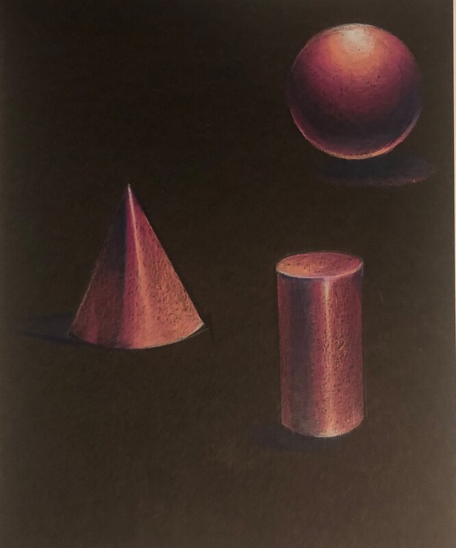
Value forms
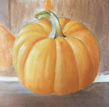
Colored pencil fruit
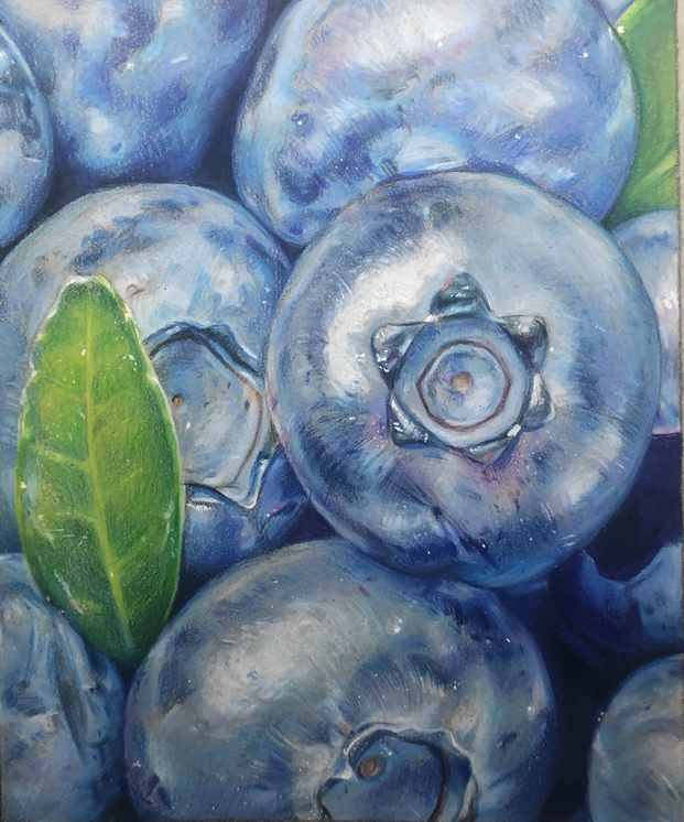
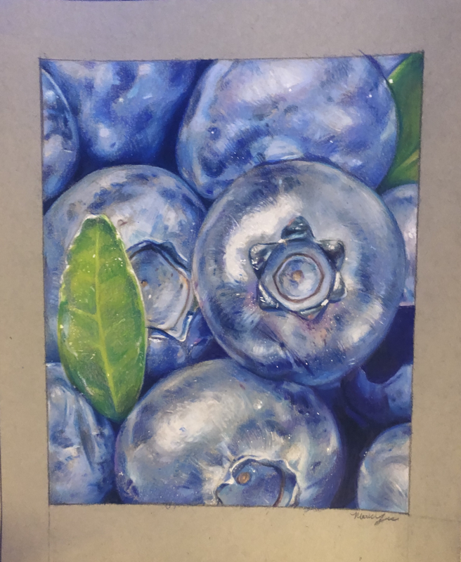
There's not much to say about this piece, however I did want to point out that for this piece I pressed down on the paper immediately rather than building up the layers first. The effect is way harsher than the portrait I did following this piece (I talk more about the layering process in the reflection below). It's interesting to see the results of two different methods.
Reflection Project
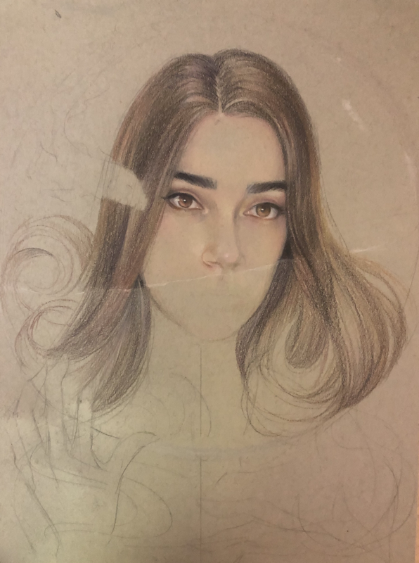
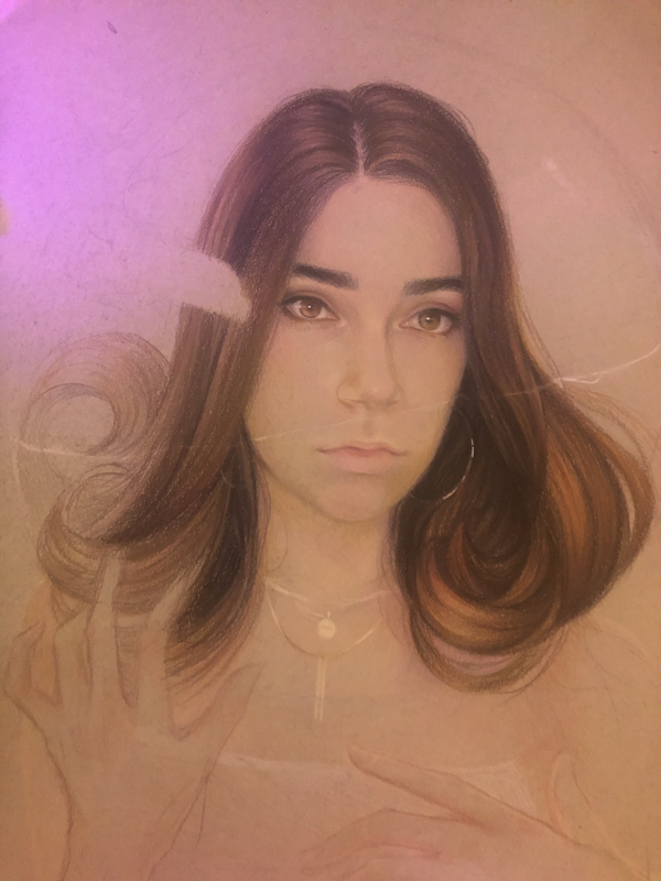
Work in progress

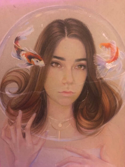
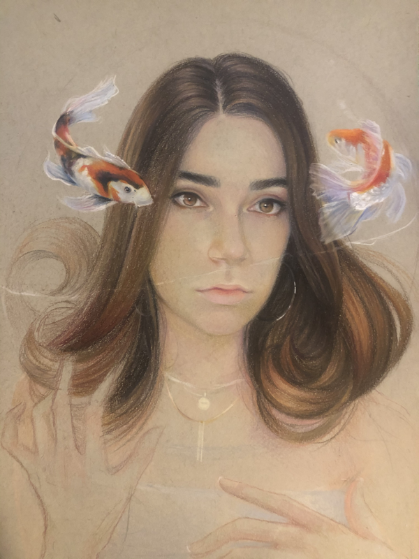
I decided to do a self portrait for the reflection project because I wanted another shot at the subject (the last self portrait I did was in sophomore year, and I wanted to see if I improved at all). I knew from the beginning that I wanted to do something kind of surreal, and I wanted to include a fishbowl for the reflection part of the project. Essentially, I wanted to illustrate a feeling of being trapped with your emotions; the water symbolizes drowning in your own thoughts, and the fish symbolize thoughts and emotions. The concept was a little too dark at first so I chose to add the koi fish as a fun pop of color and to also illustrate that the thoughts and emotions I'm conveying aren't necessarily dark, they're just floating around in my mind. I also added them to reflect the color in my eyes (for continuity purposes, idk it just seemed like the right decision). One thing I absolutely hate about this piece is that the hand to the left is backwards. I do this literally all the time and you'd think I would learn my lesson by now but I was rushing the final details and that was the result. I disliked it so much that I went back digitally and edited it for a portfolio submission. Despite this, I think the early stages of this piece were successful. The portrait looked really soft and airy, for lack of better words, and I really liked that aesthetic. Unfortunately the final picture was taken in poor lighting, so it doesn't showcase the textures very well. Though I kind of butchered this portrait by rushing the finishing touches, I feel that I understand the medium well now. It's a tedious process, but layering the pencil achieves the most realistic effect (rather than burnishing after a few layers). I'll keep this in mind when I work on my next colored pencil piece.
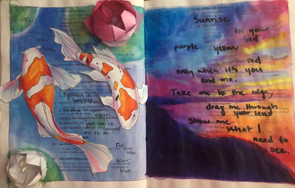
Altered book project
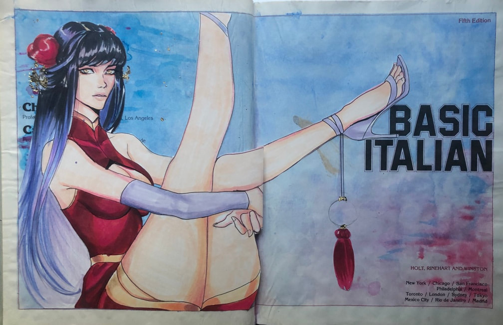
I added text to the first page at a later date, however the page crinkled from the watercolor so I’m using an older version to showcase the page.
I was honestly really stumped for this project. I've never been good at like, arts and crafts, I guess is the term to use? Thinking beyond a canvas is totally alien to me, and I had no clue how to incorporate different mediums on these pages. I started with something I was familiar with, figure work, and went from there. I knew I wanted the pages to give off a serene vibe, so I kept the background fairly simple and focused on detailing the girl. It was the first time I used gold foil, and it was like so addicting to use. It's like instant gratification. Also a side note, I chose to keep the original text in the book because I felt like it added an extra element to the aesthetic. Plus, I'm Italian (: I didn't realize how much of a pain this book would be though; the pages had some kind of wax coating on them, so the watercolor glazes did not stick well. The pages are quite old too, and they ended up shriveling and ruining the pages. I learned very fast that less water is more with these kinds of book projects. I feel like every page was unique, and I had a ton of fun doing the origami lotus flowers (like I said above, I'm terrible at arts and crafts, so being able to do these was a huge victory for me) and the koi fish as well. I feel like I probably should have mapped out where I wanted the text to go, as it looks a little rushed, but whatever. Overall I thought this was a fun project and it challenged me to get way out of my comfort zone.
I was honestly really stumped for this project. I've never been good at like, arts and crafts, I guess is the term to use? Thinking beyond a canvas is totally alien to me, and I had no clue how to incorporate different mediums on these pages. I started with something I was familiar with, figure work, and went from there. I knew I wanted the pages to give off a serene vibe, so I kept the background fairly simple and focused on detailing the girl. It was the first time I used gold foil, and it was like so addicting to use. It's like instant gratification. Also a side note, I chose to keep the original text in the book because I felt like it added an extra element to the aesthetic. Plus, I'm Italian (: I didn't realize how much of a pain this book would be though; the pages had some kind of wax coating on them, so the watercolor glazes did not stick well. The pages are quite old too, and they ended up shriveling and ruining the pages. I learned very fast that less water is more with these kinds of book projects. I feel like every page was unique, and I had a ton of fun doing the origami lotus flowers (like I said above, I'm terrible at arts and crafts, so being able to do these was a huge victory for me) and the koi fish as well. I feel like I probably should have mapped out where I wanted the text to go, as it looks a little rushed, but whatever. Overall I thought this was a fun project and it challenged me to get way out of my comfort zone.
Oil veggie
“Self”-Portrait in progress
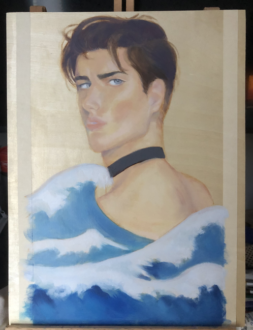
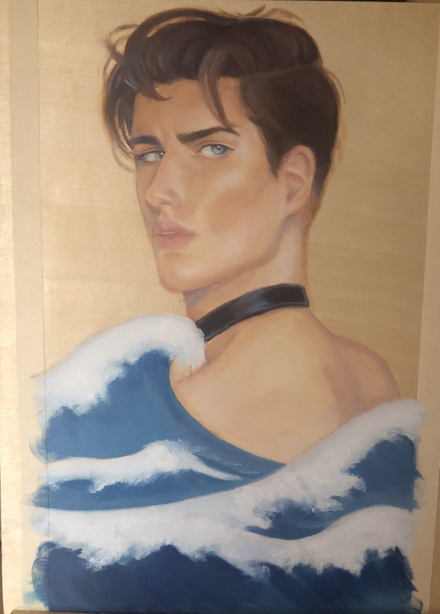
For this painting I wanted to challenge my understanding of skin tones. In 2020 I wanted to focus on working outside of my comfort zone, so I started drawing more men, but I never attempted to paint a male portrait until this project so it was definitely a struggle. I partially used a reference (thanks Daniel) then filled in the rest of the portrait from my mind. I don't recommend doing that, but I was curious to see if I could apply my digital skills to traditional (coming up with things from imagination). My process for this piece was also not something I would recommend, as I was pressed for time and I started working straight away by blocking in the shapes, rather than spending the time to sketch out the anatomy. I did this because I can visualize things easier when I block in the shapes first, however as a result of this approach my anatomy suffered quite a bit. Ultimately I think it looks pretty okay, as long as you don't stare at it for too long (:. I never got the chance to add the gold foil and texture to the waves, which I feel like would've brought the portrait together a bit more, but overall I learned a lot from this piece. I feel like the colors were the most successful aspect of the painting, particularly in the skin tone, which gives me a bit of confidence in my oil painting skills. Traditional painting has never been my strong suit, but after doing this piece I feel like I want to give oil portraits another go.
