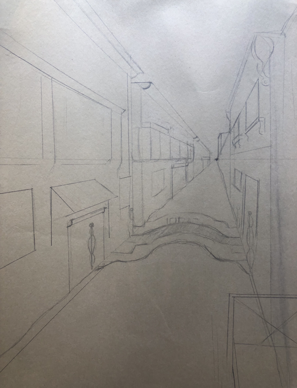
Drawing 1: Point perspective
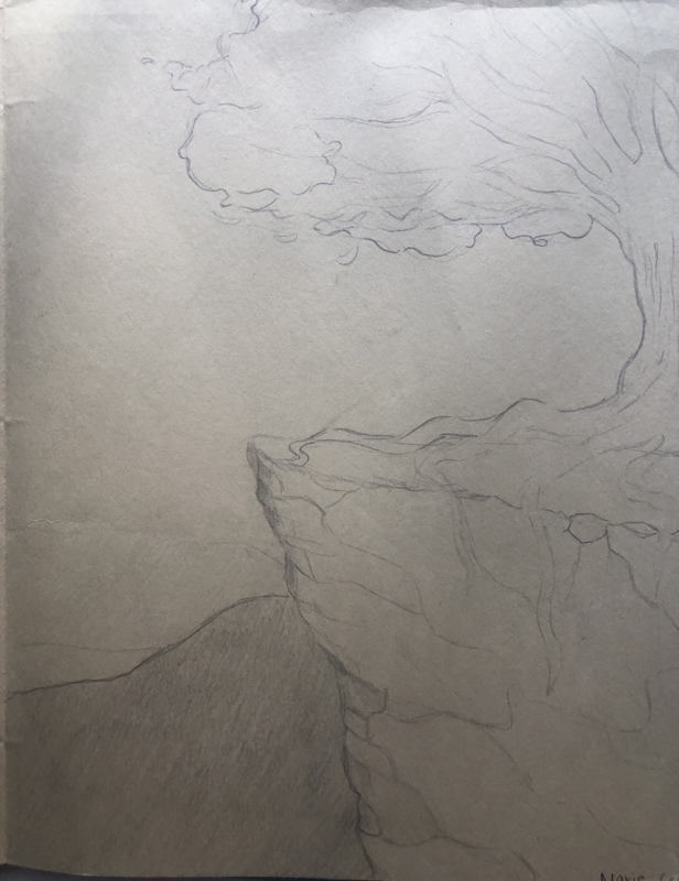
Drawing 2: Tree
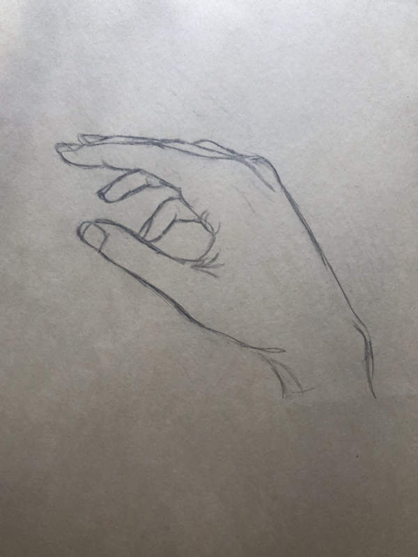
Drawing 3: Hand sketch
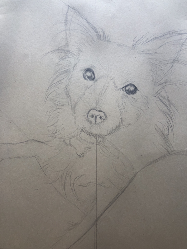
Drawing 4: Friend’s dog
Drawing 2: Tree
Drawing 3: Hand sketch
Drawing 4: Friend’s dog
Colored Pencil FRUIT (CherrIES)
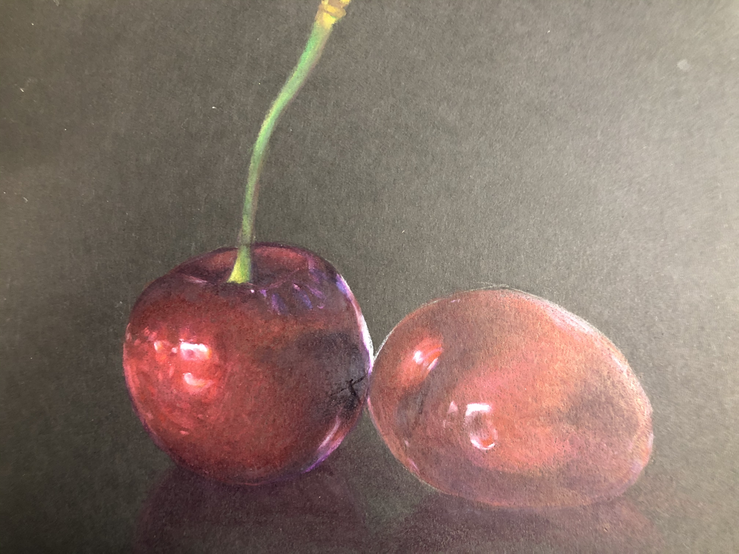
Cherries done in Prismacolors and Caran D’Ache.
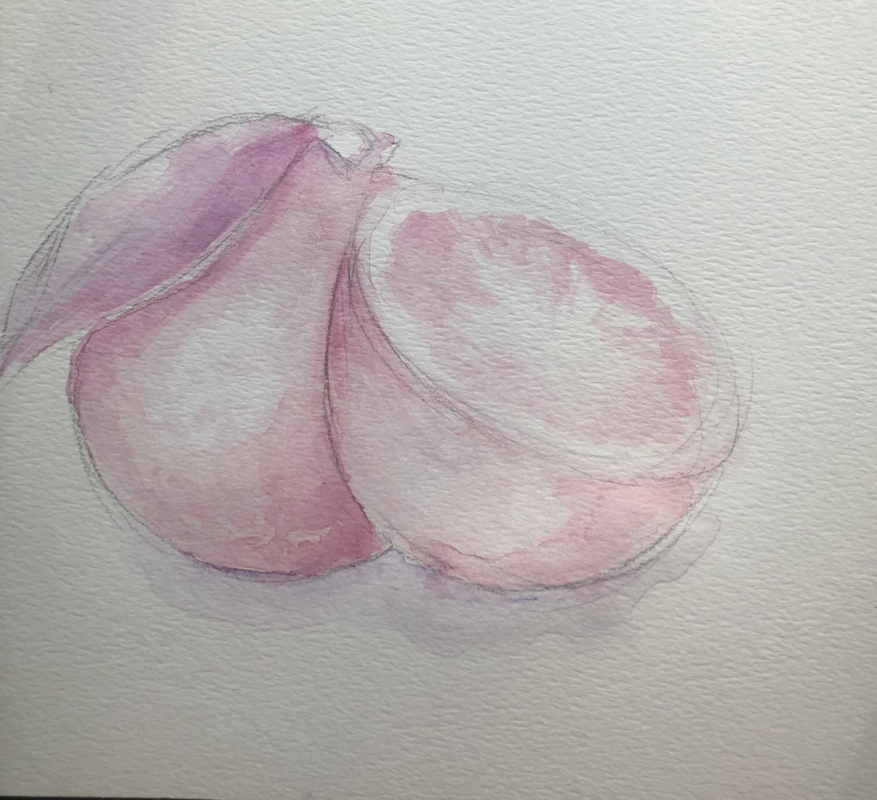
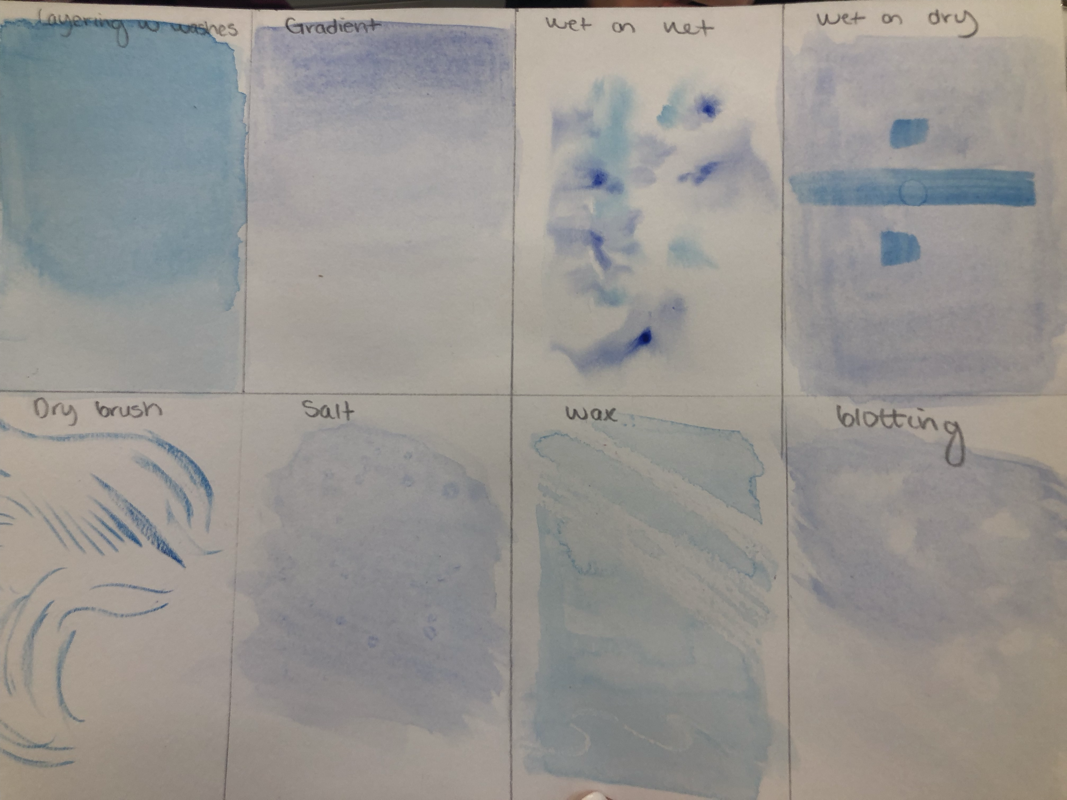
Watercolor study
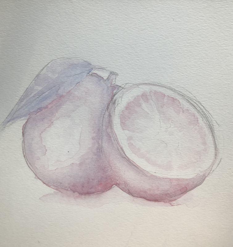
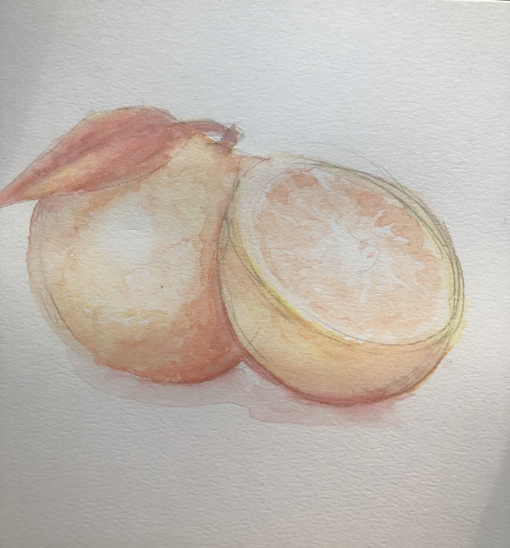
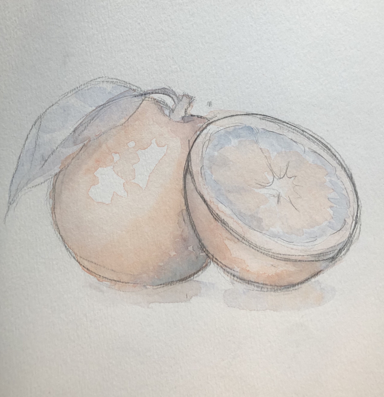
Watercolor orange studies; analogous, cool tones, monochrome, and complementary color schemes were used.
Watercolor Value chart & shapes
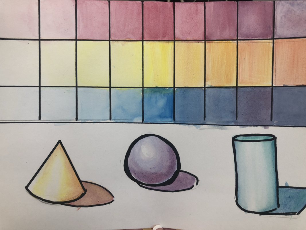
Value charts and practice in watercolor. Tried to focus on darkening values without losing too much saturation.
Watercolor flowers
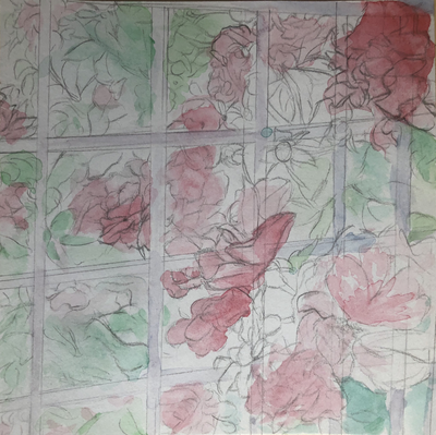
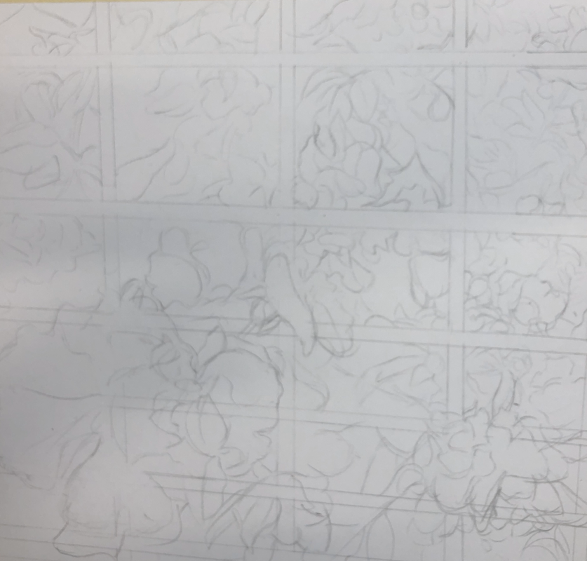
Watercolor composition sketch for final
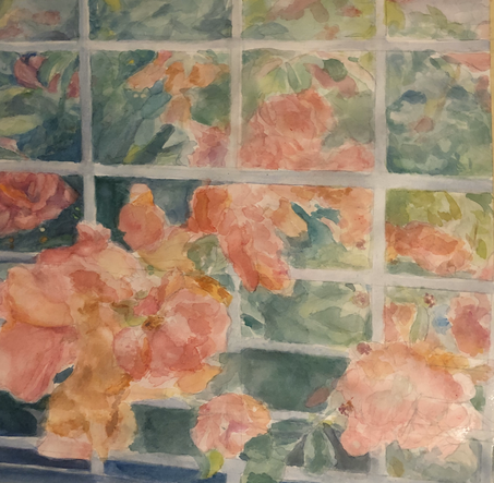
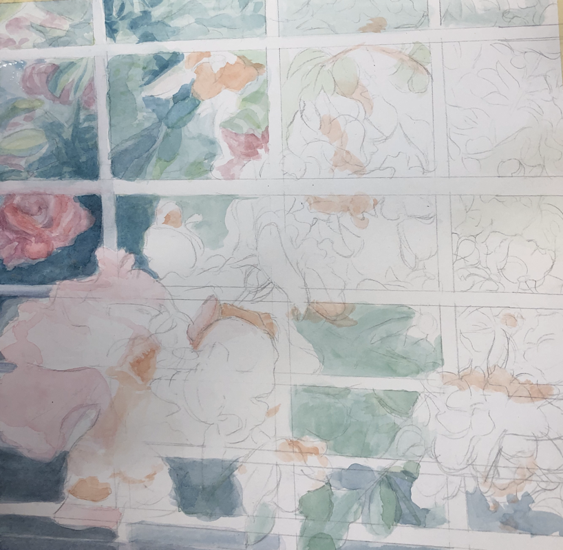
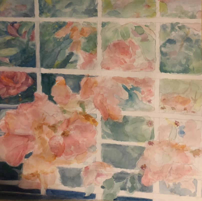
Watercolor paintinG- shakeshack Roses (Wip)
Critique Questions:
1. For my watercolor painting I mostly used wet on wet and dry brush techniques. Applying color wet on wet allowed me to get smoother transitions and blends between colors, adding to the semi-realism of the piece. Using a dry brush resulted in texture, extra-saturated areas (ex: middle of roses) that added to the overall depth of the painting.
2. Using transparent layering was essential in the the success of my piece because I could build up color in a natural looking way. Watercolor paints are very desaturated on application, so it was important to layer the paint to get bolder colors. Without the bright colors it would be difficult to distinguish the background from the middle and foreground.
3. The composition of the painting was successful because the line of movement (showcased in the flowers) moves the eye across the entire piece. I also think the use of greens and reds for the background and foreground respectively made the flowers stand out pretty well. The complementary colors really unified the piece while distinguishing the different elements of the piece.
4 Color choice was super important for the success of my painting. I knew using the same color but different shades would result in the piece looking pretty flat. Instead, I used different hues of similar colors: for the roses I used purples and blues for the shadows and oranges for the highlights. I think this really added to the depth of the piece, thus making it look more realistic.
5. I don't often use watercolor, so my approach to the piece was kind of to layer on a flat color and establish shapes first. This resulted in a really messy, disorganized process. I really struggled at first but things started to come together after the first few layers. I just kept layering on color and observing different shapes from my reference photo.
6. If I was able to redo my painting, I would like to have paid more attention to the shapes and layered on color slower. I messed up a good part of the paper in the beginning, and some strange shapes resulted from my confused painting. I wish I had started by layering a wash of a flat color so there were no random blank spaces in between the leaves. I also wish I layered colors more relevantly to their actual shapes. It was hard to correct the shapes of the flowers when I had already layered on several washes of dark green/blue.
7. I learned from my painting experience that watercolor takes a lot of patience and thought. I figured I could roughly sketch my piece out and correct things later, however I found out the hard way that it's super hard to go over colors. I realize now it's important to plan out the shapes in the piece, and it's equally important to wait for layers to dry before continuing. Despite these mishaps, the biggest thing I learned is that watercolor is a fun and refreshing medium. I liked how versatile the paint was and the soft colors you could achieve. I think it would be really interesting to paint another piece in a different style that suits the soft, desaturated appearance.
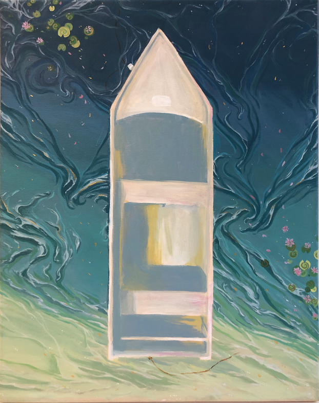
Hundertwasser painting (wip)
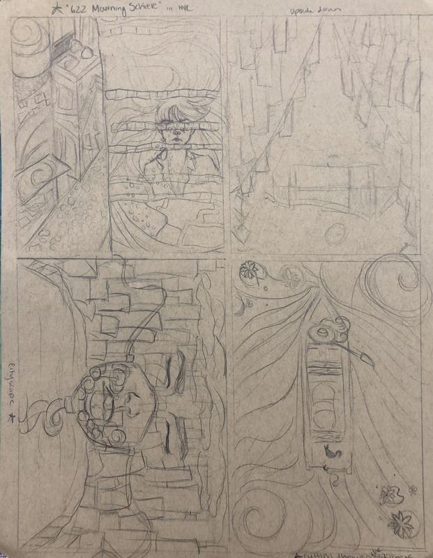
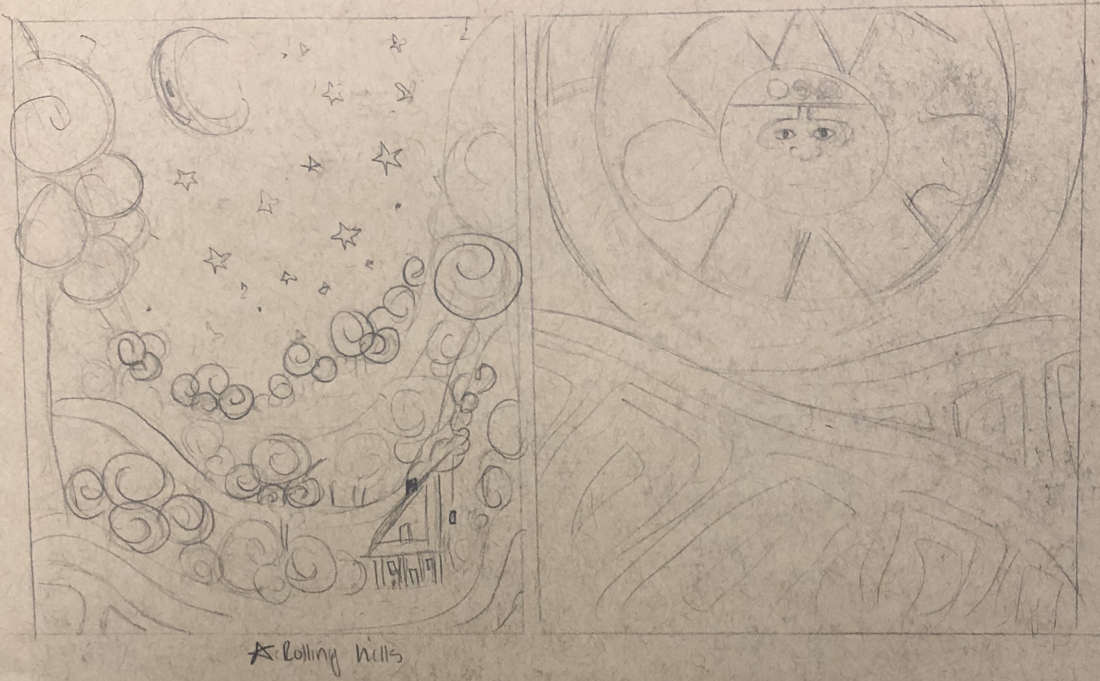
6 initial sketches
Initial 6 sketches, focusing on borders and spiral patterns. Final two colored sketches.
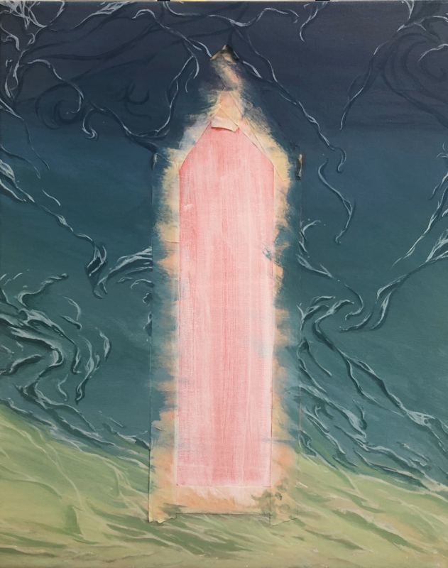
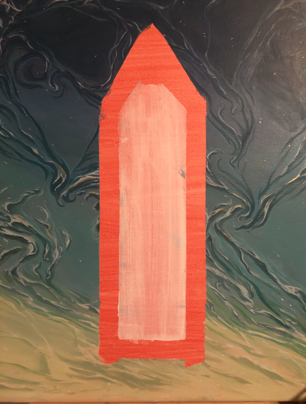
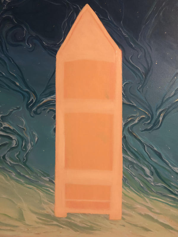
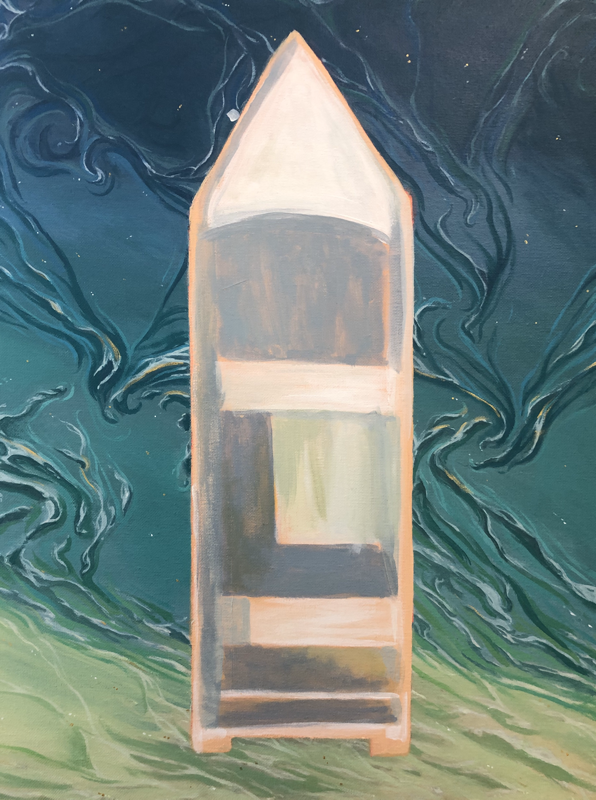
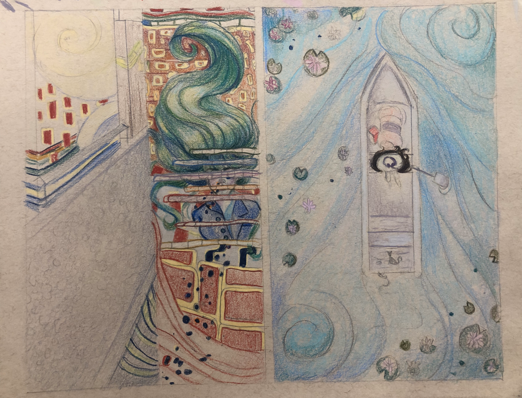
Progress from start to finish
Hundertwasser Critique Questions:
1. The painting is not as neat as I would’ve liked for it to be, however I think that the messy appearance reflects the Hundertwasser style of curved/wavy lines. I think that the one aspect that turned out relatively clean was the water in the background. The swirling seafoam on the water’s surface looks neat but still stylized, similar to Hundertwasser.
2. The hardest part of this painting was embodying Hundertwasser’s abstract style. I personally work in semi-realistic to fully realistic styles, so this was a challenge for me. My goal was to combine several key aspects of his style, such as the spiral patterns and gold embellishments, with my preferred style of painting. I think the painting could’ve used more of patterns, however I think it is evident that the painting is influenced by Hundertwasser.
3. When choosing my colors, I wanted to consider the colors in the reference picture I used but intensify the saturation to emulate the abstract style of Hundertwasser. By studying his work, I noticed that there was a big emphasis on color theory and block color. I approached my work by starting with a gradient in the water visible in the reference picture, then layering on solid colors in a pattern to mimic the look of seafoam. I was inspired by Hundertwasser’s usage of patterns, so I also added an arrangement of lily pads of various greens to complement the greens in the water. Hundertwasser used a variety of colors in his works, and because the colors of my piece were so cool, I wanted to make the boat a warm tone. However, this looked really out of place, so I settled for some pink values in portions of the boat as well as in the flowers. I think the pink of the middle ground flowers really completed the piece, as it breaks up all the blues and greens happening in the background.
4. The focal point of my Hundertwasser piece is the boat, centered on the canvas. I was inspired by one of Hundertwasser’s paintings, “831 Tender Dinghi” which featured two men in a boat. I was really intrigued by the shape of the boat cutting through the current, and I wanted to do my own spin on it. I originally wanted to add a woman in a sunhat on the boat, however, I ran out of time. I feel like this contrast of shapes and colors would’ve brought the focus more so to the boat, but I’m still satisfied with the results. I think the colors of the boat turned out well and brings your attention to the center.
5. I used textures and patterns to represent movement in the piece. The majority of my patterns can be found in the water; the spiral waves and seafoam, which suggests the water is in motion. I think this adds to the flow of the piece. If I had more time, I would’ve liked to add more patterns to the boat to really showcase the Hundertwasser style.
6. I did not use a border in my painting. Instead, I used the iconic spiral shapes of Hundertwasser works. I think this helped showcase his style, as well as add interest to the background.
7. The most difficult part of this project was getting out of my comfort zone and painting in a more abstract style. While I think the end result still reflects my own, personal style, the influences of Hundertwasser made painting this both refreshing and challenging. I don’t normally work with bright, solid colors and simple shapes, but painting the Hundertwasser piece was super enjoyable. I will definitely consider painting in this style again to take a break from realism. I also feel like I could keep adding more Hundertwasser inspired-patterns onto this painting and be excited to do so.
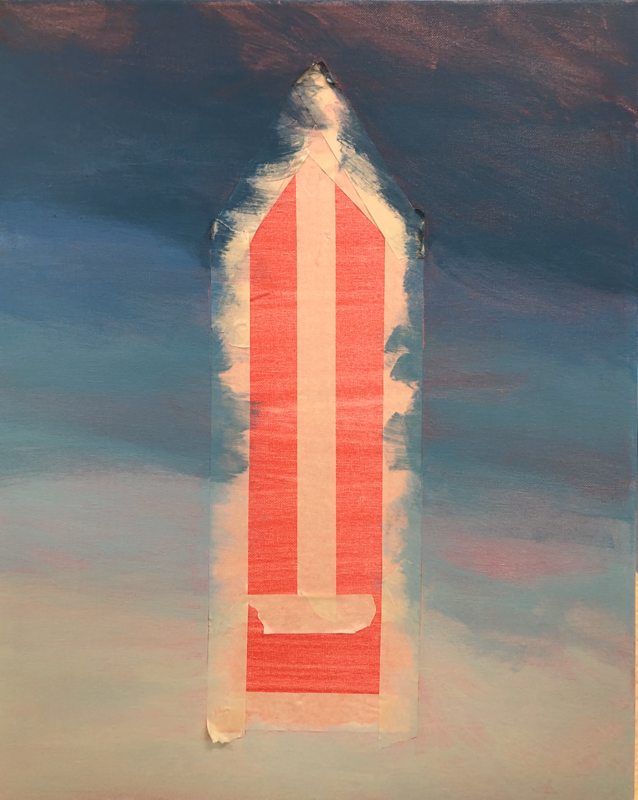
Oil paint Fruits/Vegetables (WIP)
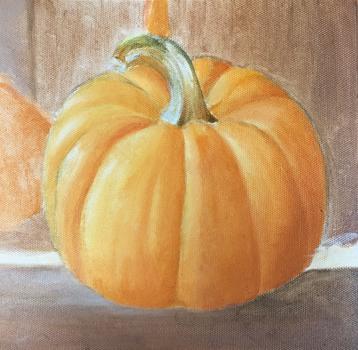
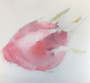
First attempts in oil paint, pumpkin done with a brush and dragonfruit done with a palette knife (WIP)
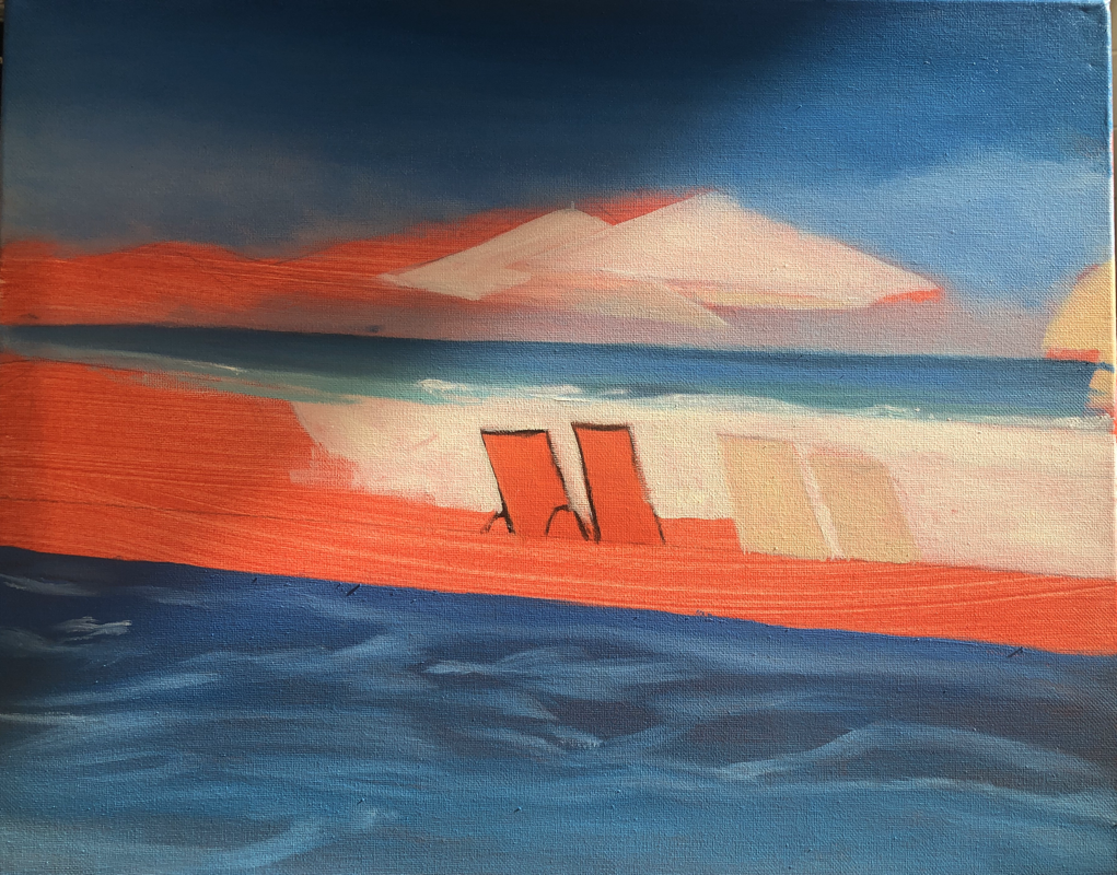
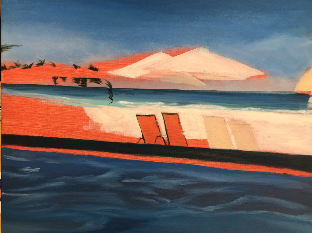
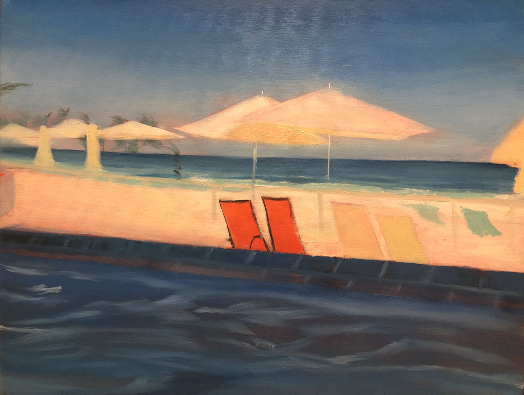
LAndscape in oIl WIP
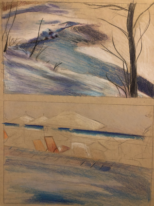
Quick colored sketches
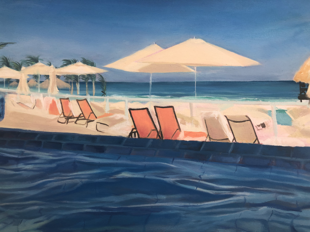
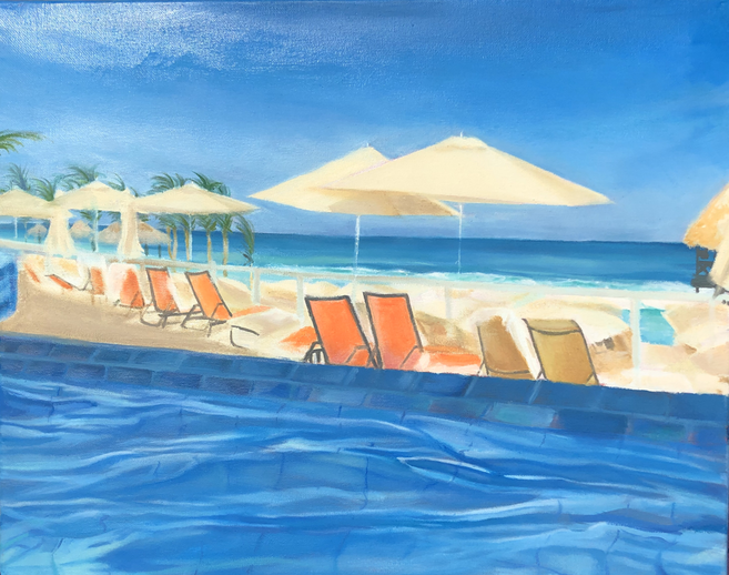
LandScape final
1. My painting turned out to be relatively neat, but it more so resembled a laid-back, painterly style. I worked in multiple layers to ensure clean lines and hopefully it resulted in a well executed painting.
2. I chose my reference picture because of the complementary color scheme; I wanted to emphasize this in my piece. I made the orange chairs especially vivid to break up the excess of blue in the pool, ocean, and sky.
3. I created contrast in my painting by cutting the blue overload with a bright strip of beige. The orange chairs also provide contrast against the blue because they're complimentary colors. Additionally, the umbrellas create a nice contrast against the sky, since their shapes and brightness break up the relatively shapeless blue sky.
4. I used texture, highlight and shadows to add to the realism in this piece. I attempted to add texture in the pool water to show movement and realism. I used the highlights and shadows to create contrast and show the environment (like the position of the sun) most accurately in comparison with the picture. I focused mainly on the pool and nailing the reflection of the floor tiles, and I think that was the most successful part of the piece.
5. I created depth in my painting through strong contrast between highlights and shadows and utilizing shades and hues. The most intense shadows cast by the umbrellas make a distinct foreground and background. I wanted to make the piece easily readible, so I opted for strong contrast versus realistic shadows/highlights. I used different hues, such as the yellows on the pool's surface, to make the piece seem more realistic. Perspective also helped give the piece more depth.
6. I used a dry brush method to make my piece appear more realistic. In the clouds and ocean specifically, the dry brush method allowed me to softly blend all the colors without any harsh lines. I used a wet-on-wet method in the pool tiles to make the colors appear more cohesive, and then layered on a flat color with a dry brush after it had dried to show texture.
7. I wish I had spent more time on the details of the piece. I think towards the end I just rushed painting it and it shows. The pool has a lot of details and colors, while the chairs and railing have none at all. I also wish I had gotten straighter lines in the rails/umbrella poles since it would make the piece look less rushed and more realistic. In the future I would like to nail the perspective in my sketch/use a ruler and a steady hand while painting straight lines so it looks more realistic.
8. I think the most successful part of this painting is the pool. I really wanted to create the illusion of a reflected surface, so I ended up spending the majority of my time painting and repainting it. I used purples and yellow hues in the shadows and highlights respectively, something I didn't really continue throughout the piece. When I painted the distorted bottom tiles, I thought that it actually looked like it was supposed to and I was super excited. I feel that the entire piece could have been just as successful if I had slowed down and spent a bit more time on the details.
Pet portrait
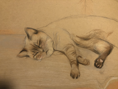
Quick colored sketch.
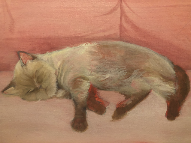
1. My pet portrait is soft but distinct, and also quite messy. I've always had trouble working in oil, and this was my second or third time trying it. In general I have never done a pet portrait; this was probably the most frustrating project of the semester for me. The most difficult part of the project was capturing the softness of the reference photo, as in using the correct values all while making sure the detail was distinguished.
2. I accomplished realism in this piece by utilizing liquin and thin brush strokes, first layering on the darker shadows and then painting the lighter hairs over top. I tried to stay away from blending for this piece to show the texture in the fur, but I blended the background to make sure it didn't take away from the cat. I also chose the pink sofa color for the background to ensure that she stands out. I keep stressing this, but the major aesthetic of the painting was the softness of the cat. The reference photo was adorable, and I wanted the art style (my brush strokes, the color, etc.) to match sleepy little Coco Chanel. (:
3. I used the techniques learned from practice in class mainly with the fur around her face. I wanted to layer the brush strokes so there was a wider range of color, which gives the illusion of depth. I started with the darker values and gradually transitioned into the lighter, all while keeping that brush stroke shape/form.
4. This project taught me a lot about patience and the importance of color theory. Since I have never painted a pet portrait before, I wasn't sure how the painting would turn out. When I started painting this piece it was really fun and carefree, but I quickly realized that my colors were wrong and it became a painstaking process to correct it. I still did not get the right hue for the fur, but I think that the shape/texture of the fur turned out alright. Ultimately, I think that this piece could have turned out better if I was more patient with the process. Instant results are not a thing, and I suppose I need to learn that.
5. I struggled quite a bit on this piece. I did not really achieve the soft look I was going for, nor did the colors or the texture turn out how I intended, but I tried my best for my first pet portrait. I think that the cat itself turned out fairly well, and I definitely want to continue painting animal portraits like this. Hopefully in the future I can get that realistic look down through more practice with textures and color theory.
Glass Painting
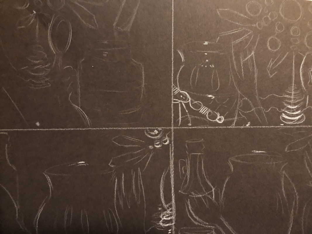
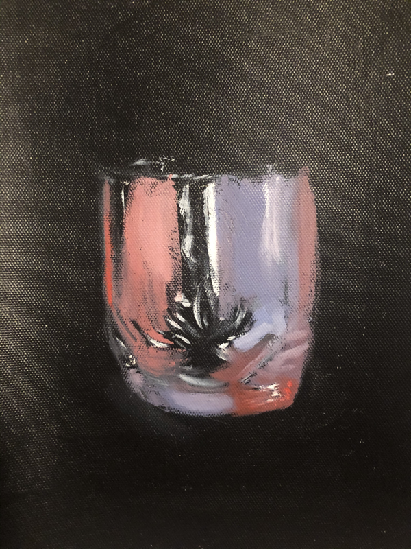
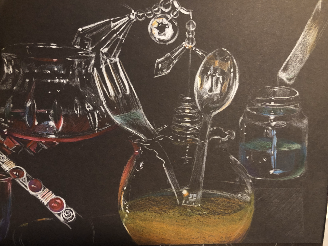
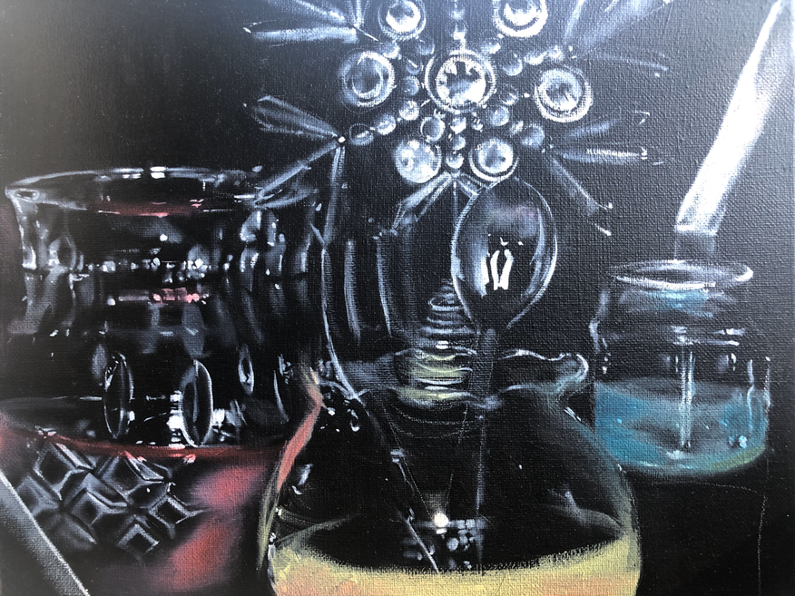
1. I really liked how this piece turned out. I spent quite a bit of time on the white portions of the glasses, particularly the vase to the far left. It was really refreshing to paint something with little punishment for making a mistake; if I painted in the wrong place, I could easily go over the paint with black acrylic. This also helped me achieve cleaner lines.
2. I wanted to keep the focus on the white highlights of the piece, so I used color sparingly and in an abstract way. I did not originally intend on this, but I think that the end result was pretty interesting. When I paint I'm always hyper focused on capturing realism, so this was a fun change of pace. I followed the colors of my reference photo, adding reflective light where I saw fit.
3. The subject of this piece is something I'm quite familiar with, but it was overall really challenging. I had to kind of unteach myself what I know about realism and color theory, how objects react to light, etc, and just focus on the basics. Using only white and the primary colors made me feel kind of like a kid again, but it was really fun! I'm pretty satisfied with how it turned out, despite a time crunch towards the end. I definitely want to continue painting still life in the future. I know most people find it pretty boring, but it's always been really gratifying for me to push my realism skills and discover what I can accomplish.
