**THIS PAGE IS BROKEN. WORK FROM OTHER CLASSES GLITCHED & REPLACED MY WORK FROM DRAWING**
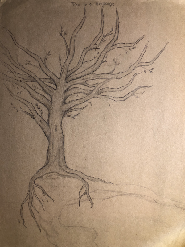
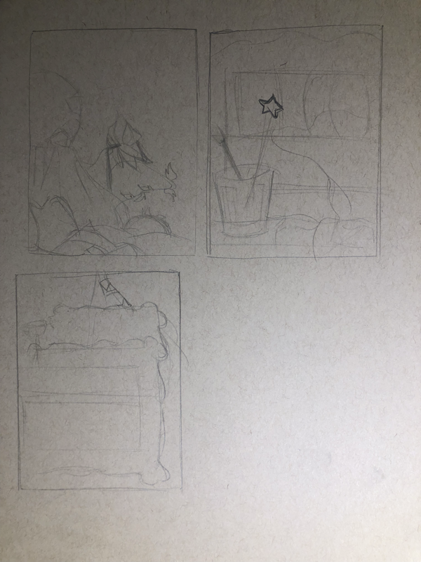
Drawing #1 Tree in a landscape- A barren tree in a cliff landscape.
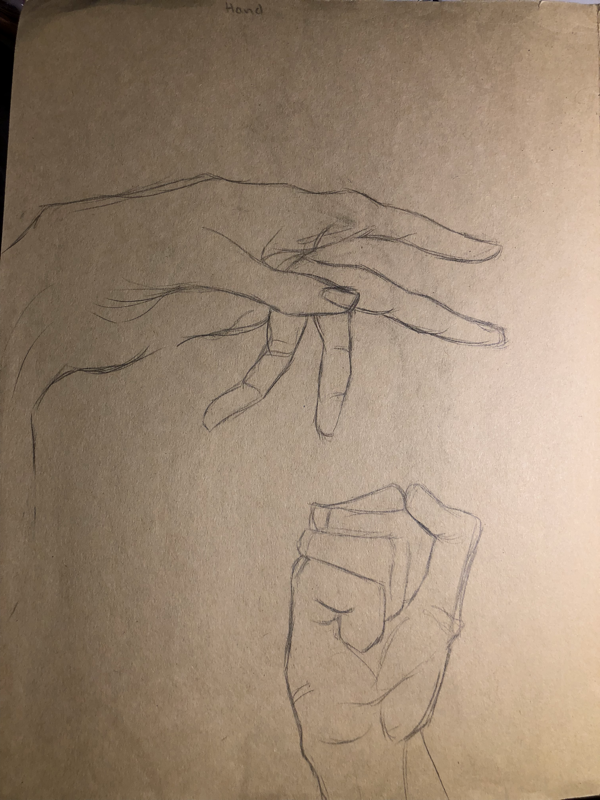
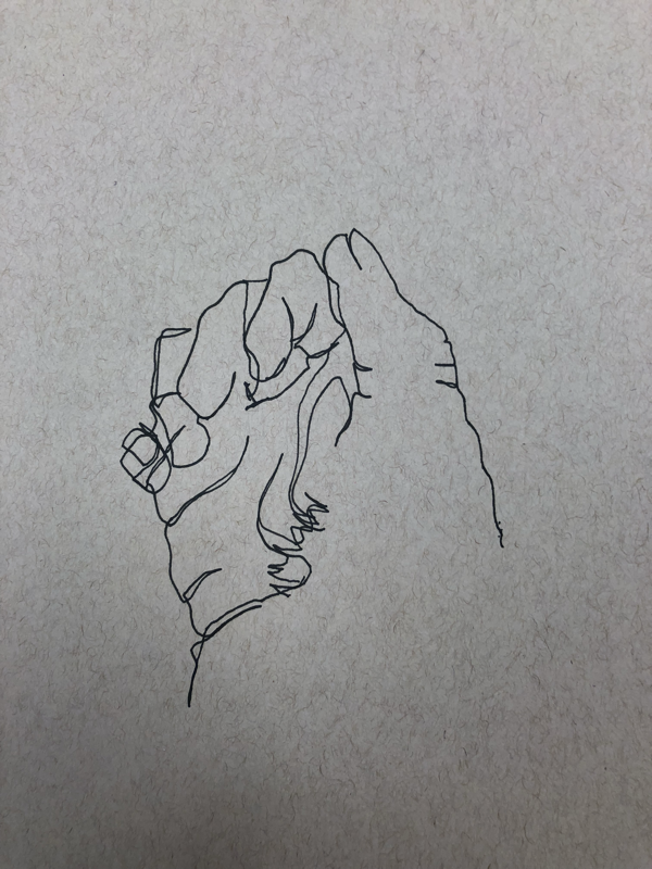
Drawing #2 Hands-Two studies of hands in different positions.
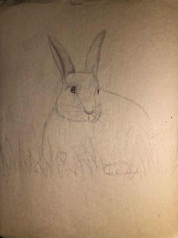
Drawing #3 Animal-A sketch of a bunny eating grass in my backyard.
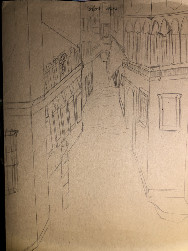
Drawing #4 Street Scene- One-Point perspective inspired by Venice, Italy.
Drawing #2 Hands-Two studies of hands in different positions.
Drawing #3 Animal-A sketch of a bunny eating grass in my backyard.
Drawing #4 Street Scene- One-Point perspective inspired by Venice, Italy.
BLIND HAND CONTOUR DRAWINGS
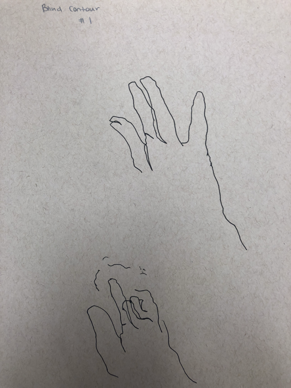
Drawing hands without looking at the paper, using flowing lines (cannot lift pen off paper)
flowing Lines Hand contour drawings

Contour drawing hands without lifting the pen off the paper (flowing lines).
Contour drawing- ShoE
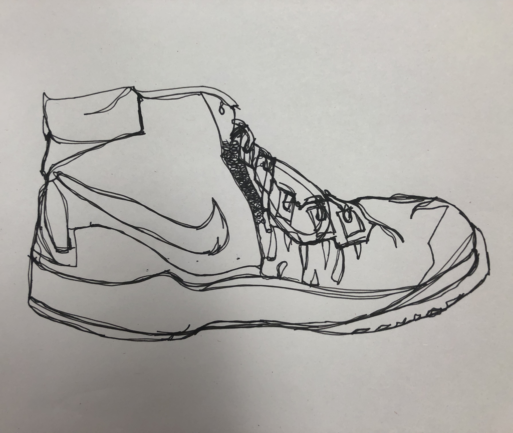
Contour drawing another student’s Nike shoe, trying to include designs and material textures.
Contour dRawing- backpack
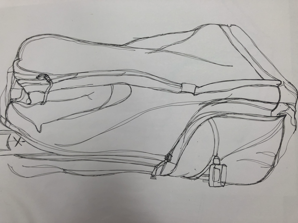
Contoru drawing of a student’s backpack, focusing on drawing it in the same proportion and getting fine details like wrinkles in fabric.
Final project- Contour Line Room drawing
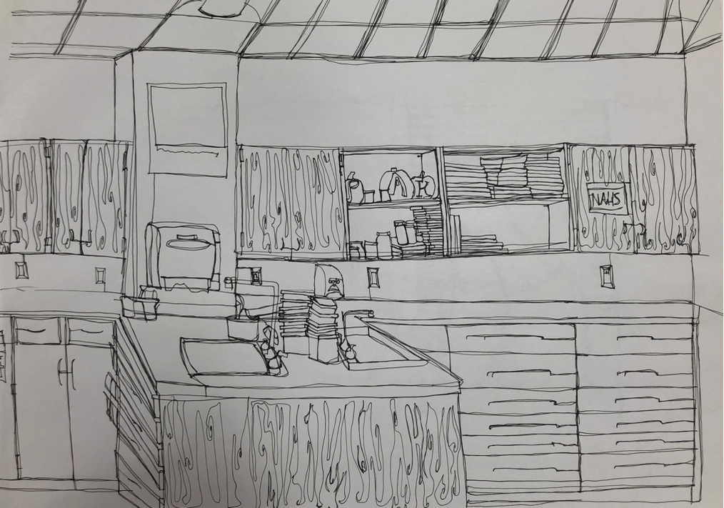
1)My usage of fluid lines is evident through flowing, singular lines that are all attached in some manner.
2)I have never done a contour line drawing before, however, my brief knowledge of perspective art helped me make a more accurate finished piece.
3) Contour line is different from outline drawing because contouring shows more detail than a outline drawing, showing wood grain and other details.
4) My interpretation of line is essential in capturing the look of the room because it gives it a sense of realism, since the lines depict a 3d space with varying textures and shapes.
6) What I learned from completing the contour room drawing is that perspective mixed with fluid lines can be a huge challenge, especially for artists that draw using short, sketchy movements. Working with pen immediately is also a challenge for me, because you cannot erase your mistakes. If I could do this project differently I would slow down and work on making smoother, cleaner lines. I went over my lines too frequently and made messy, dark and generally unappealing lines.
Paper bag vaLue drawing
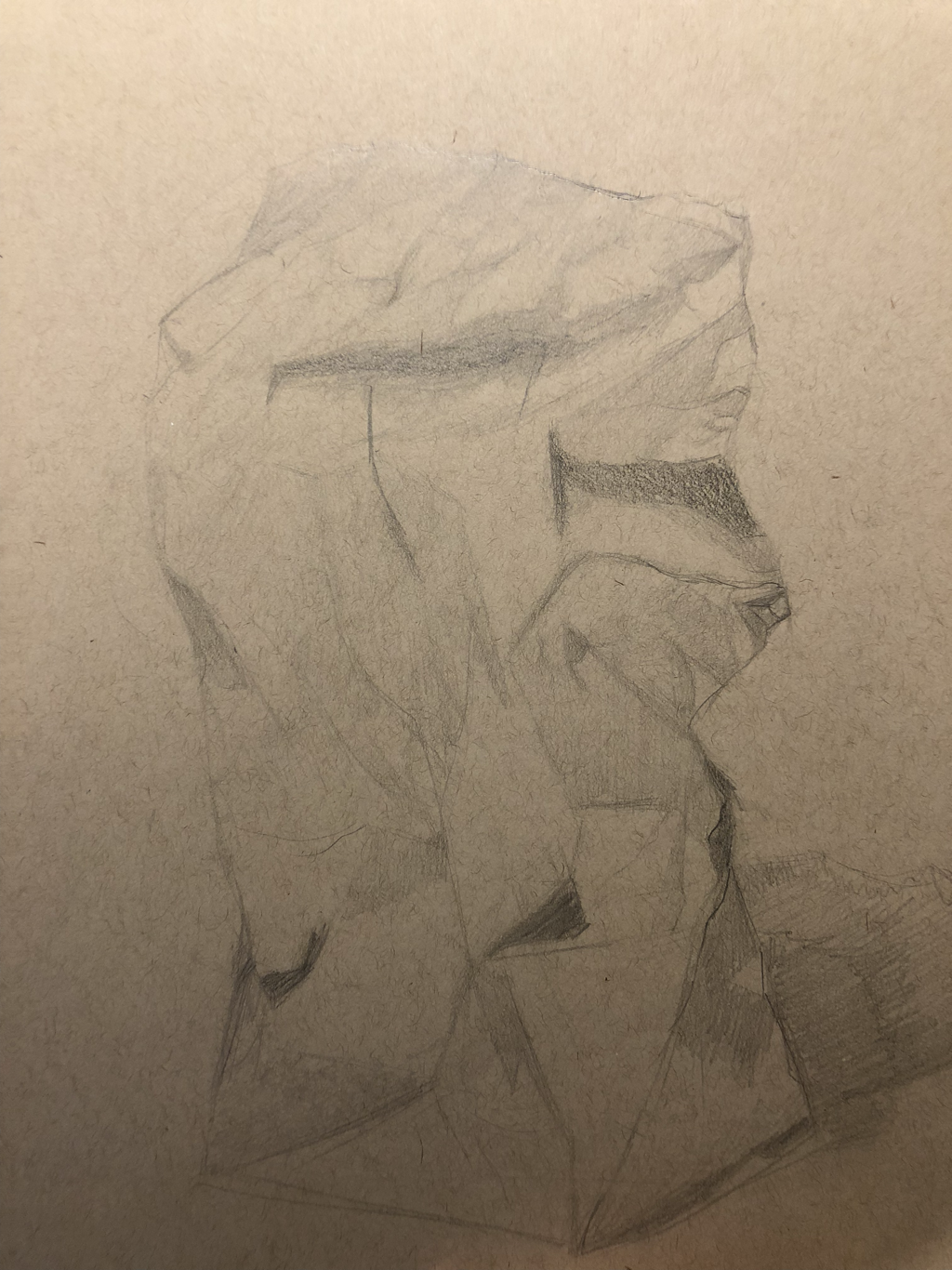
A drawing depicting a paper bag in full value using a 2H, HB, 2B, 4B, And 6B pencil.
Shapes in valUe
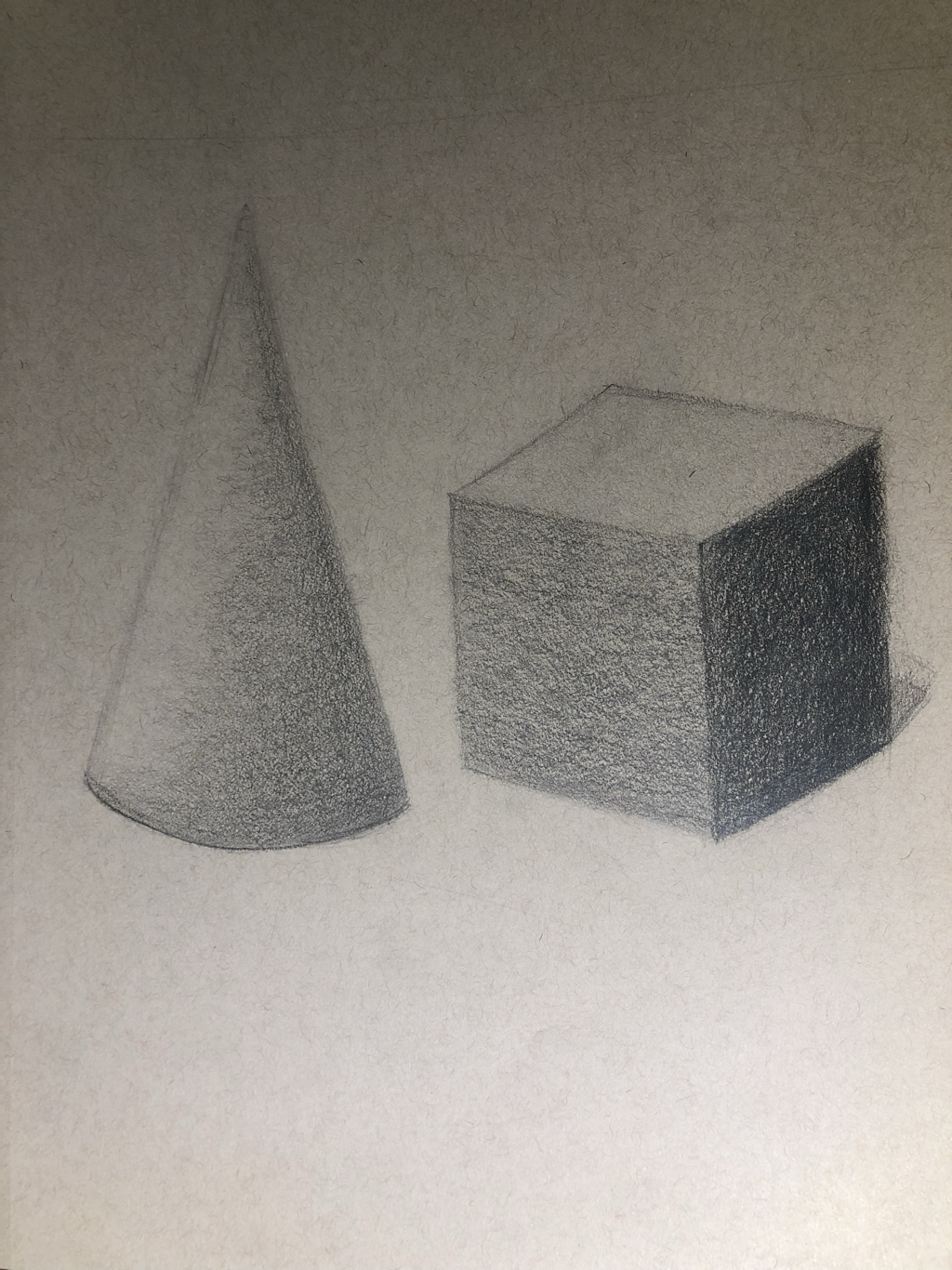
3 Dimensional shapes in full value (cone and cube).
Value chaRt
Testing out a full range of value on a sphere.
FABRIC IN VALUE
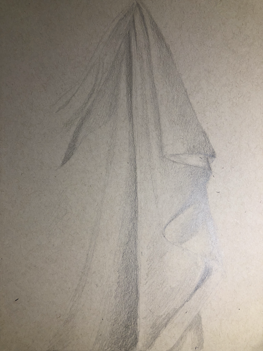
1. Yes, I used a full range of value. This is evident through the depth of the drawing, the shadows and highlight make the fabric more realistic and three dimensional.
2. Practicing using value creates more experience and teaches the basics of values which can be represented in my piece.
3. Fabric generally has smooth shading and soft edges, with stronger shadows where the fabric is farther away from your perception and lighter when it is closer. Besides this, shade from other obstructive objects creates stronger shadows.
4.Texture is important to create realism in your piece. Without texture in an object, it would look unrealistic, unless the object is smooth.
6. If I could recreate my piece I would gradually layer the graphite to get smoother transitions between shades of value.
Still life Compositional sketches
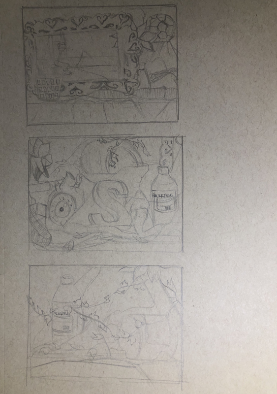
Practice sketches for the still life piece, focusing on a balanced composition and positive/negative space.
Work in progress Still life
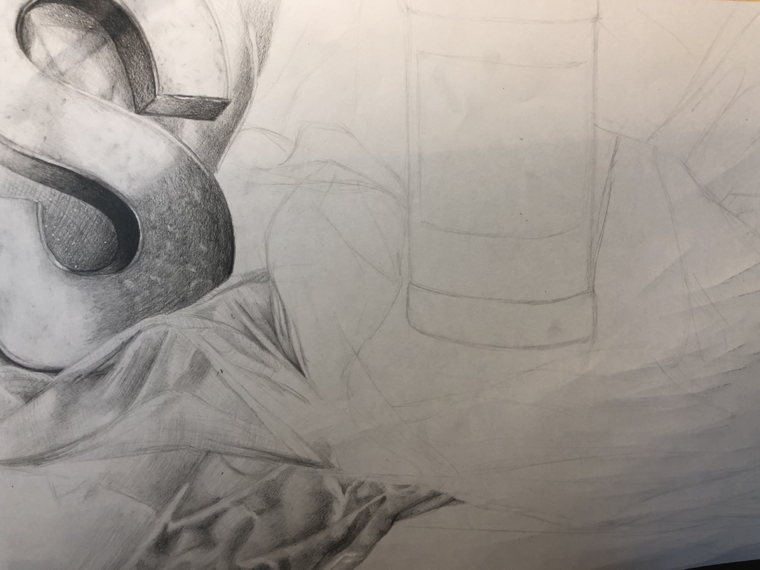
1. For my still life, I tried to incorporate clean edges to distinguish one object from other, as well as texture to identify not only where certain objects are in the piece but what they are specifically. For example, the 3D S in the still life features a more bumpy texture to show that it's made of a texturized material, in this case cardboard.
2. The values I used in this drawing are realistic because they are true to the still life arrangement. I used at least 6 values, not including in between values. Values are important because you can distinguish the objects from one another, which adds to the overall realism of the piece. Values also show texture and difference of space/lighting.
3. There is a clear source of lighting, evident by the placement of shadows and highlights.
4. Compositional sketches are important because it allows you to determine what arrangement of the objects will be most balanced.
5. My final drawing (will be) successful because the arrangement of objects are nicely balanced and the values bring out the realism of the piece and bring out each individual object rather than having a piece with all similar values.
6. The proportions, grouping of objects, and perspective follow the guidelines for still lives.
7.The placement & grouping of the objects create a pleasing arrangement because they create an informal balance, no large object is directly in the middle of the piece.
8. The center of interest in my piece is the paint bottle, as it will be the lightest value in the arrangement, drawing attention to it. It's location is close to the center of the objects, which makes it the center of interest.
9. I did not manage my time and resources well for this project. I spent too much time on the S and little details while I did not focus on the bigger picture. I could improve in this area by going through the full piece first with the basic values and textures, and then go back and do the minor details.
10. A challenge I encountered during this project was that I frequently lose interest in tasks that seem tedious. Still lives have never been my favorite subject to draw, and getting the values and textures right was a struggle too. I overcame this by studying the reference photo I took of the still life closely and replicated it.
11. Throughout this project I learned that drawing things I wouldn't draw on my own time can benefit me as an artist in general. For example, shading in the fabrics gave me more knowledge and experience with the subject, which will later help me with art that I do prefer to do, like portraits.
White Ribbon on black paper
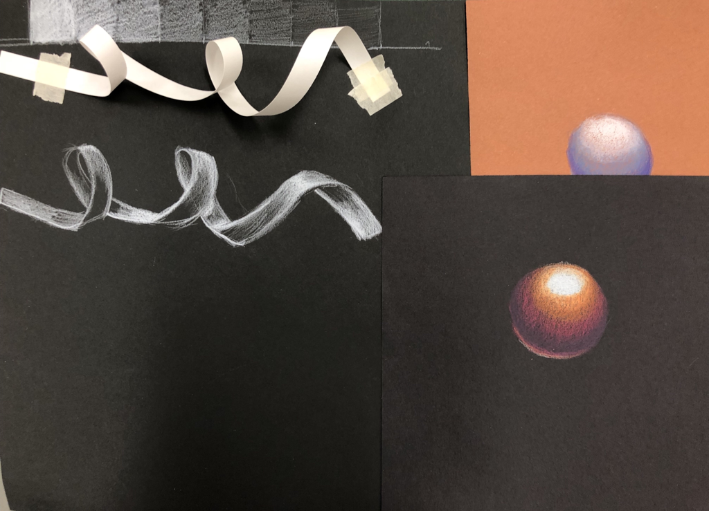
Ribbon done on black paper using a white Prismacolor pencil, plus sphere sketches with colored pencil.
Blueberry in COLORED PENCIL WIP (Fruit drawing)
Realistic blueberries using Prismacolors on toned paper.
PersPective sketches
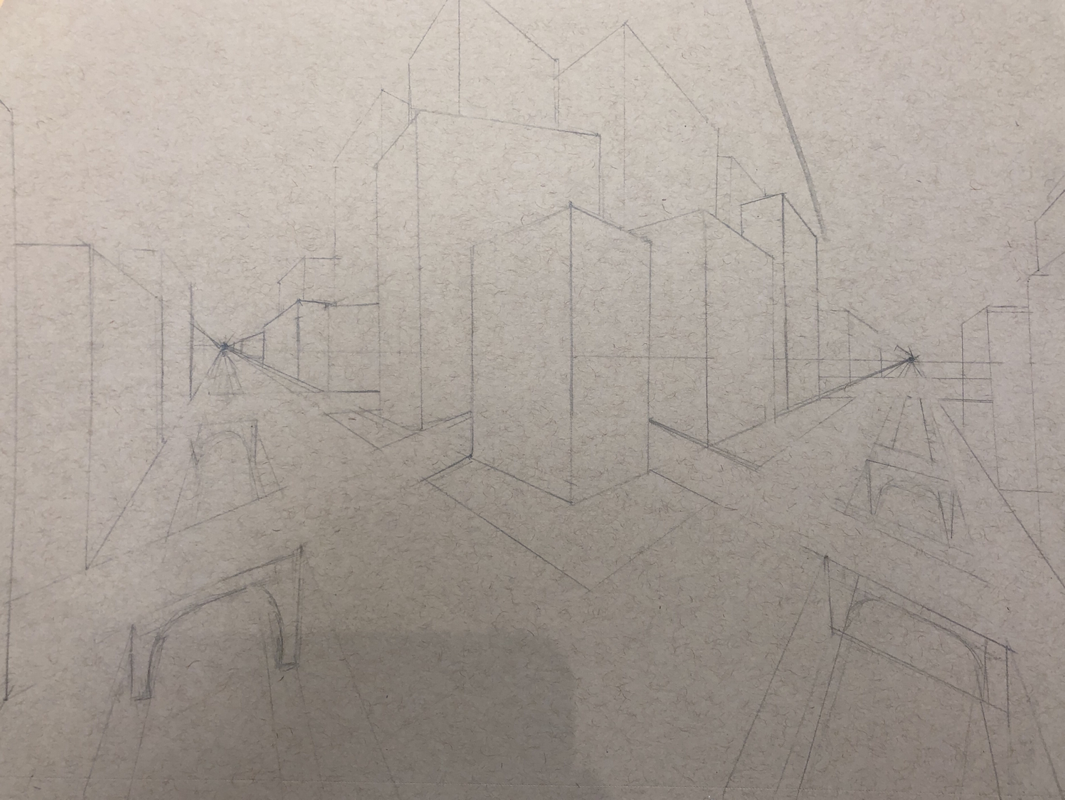
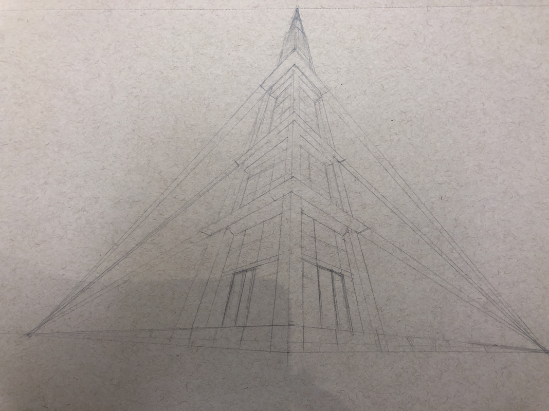
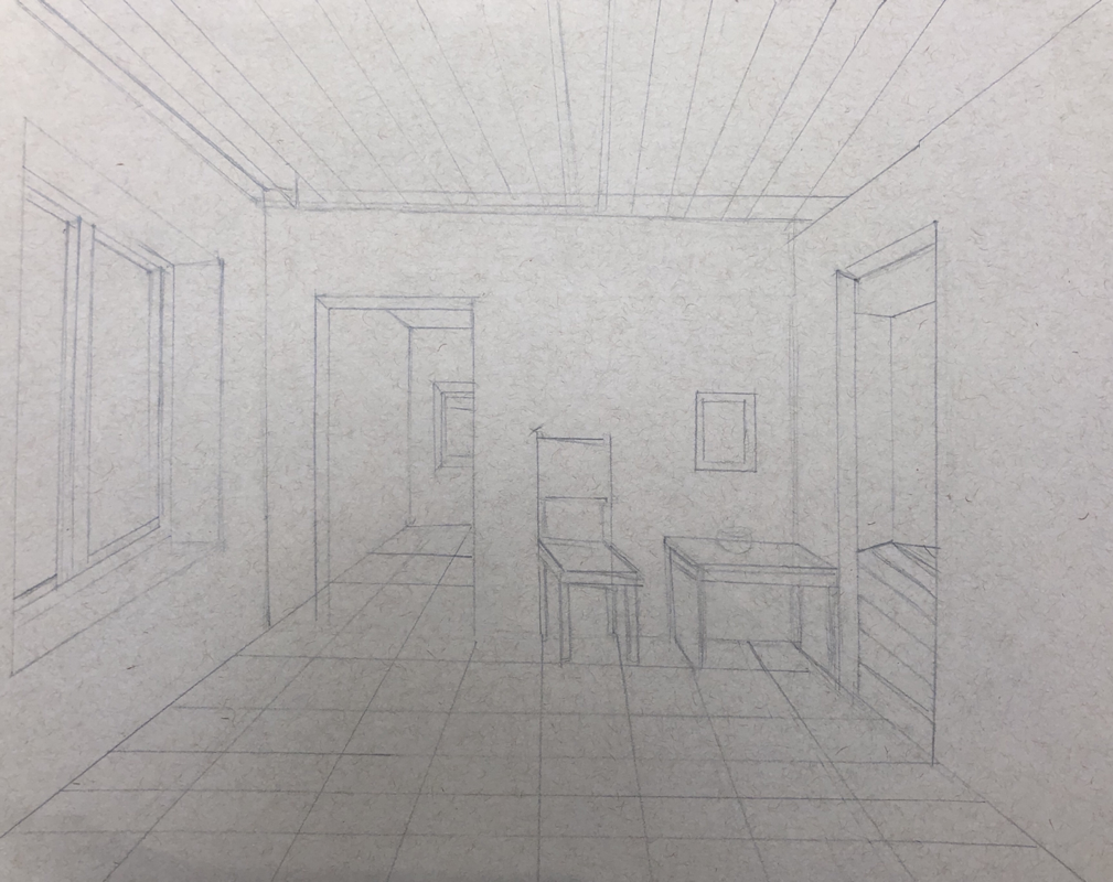
Perspective sketches from the videos (fourth missing due to PSAT day)
Look at that VIew! Sketches

Compositional sketches for final piece.
Look at that view! Final piece
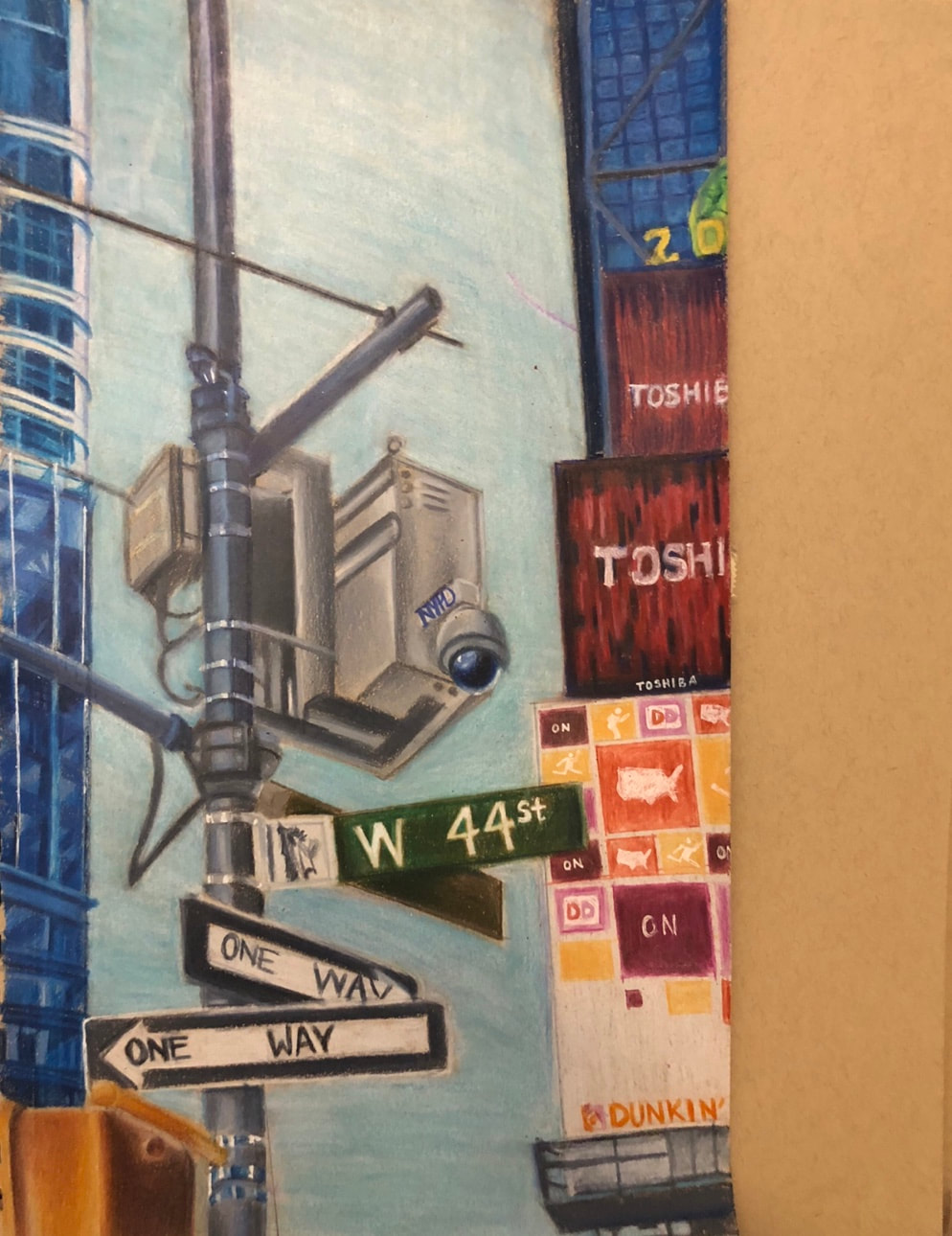
1. I created an interesting point of view by showing depth of field; the lamppost being exaggeratingly large compared to the buildings in the distance. The point of view also has a slight upward angle, so the buildings appear to be slanted.
2. It is important to understand perspective and how to draw it because it adds realism to the piece.
3.The colored pencil exercises were important to understand wax based colored pencils, how to blend them, burnishing, using color in unexpected ways, and generally getting used to the pencils.
4.I mainly used burnishing to blend the colors seamlessly and add to the realism of the piece. If the pencil is grainy and the paper shows through, then it doesn't appear realistic whatsoever. I also tried to add unusual colors in seemingly one-toned objects to add depth.
5.I think I was somewhat successful showing depth in the piece. The lamppost acts as the foreground, the buildings the middle ground, and the sky the background. The usage of blank space in the background distinguishes the buildings from the sky.
6.My experience with colored pencils in this project was a love-hate situation. It was difficult for me to color this piece because I've never drawn buildings, and I found it difficult when it can sometimes seem like buildings are one basic color. However, the advantage of using the wax-based colored pencils is that they blend easily and make things appear polished and smooth.
7.I feel I was prepared for this project, based on the practice we did with colored pencil. However, I would have liked to learn how to handle small detail when working on a larger scale piece.
values with pastels practice
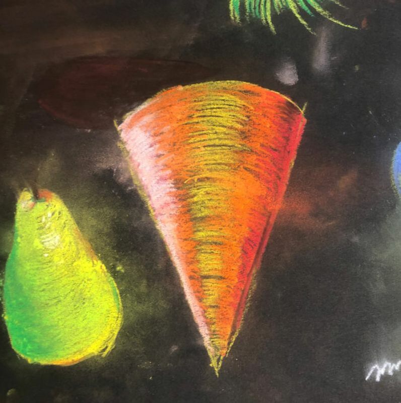
Experimenting with pastels; learning how to blend values and create depth.
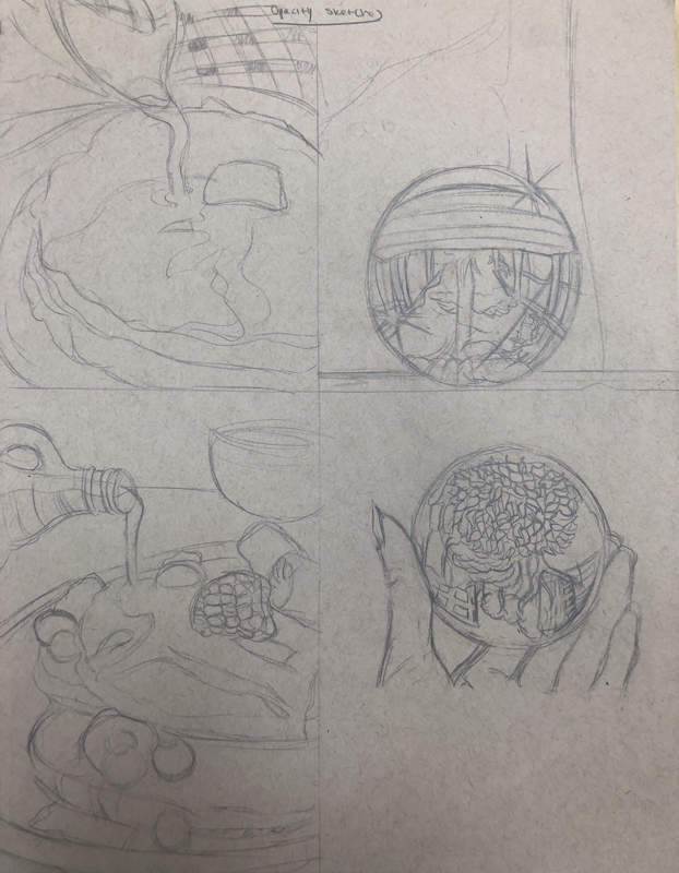
Opacity sketch and candy drawing
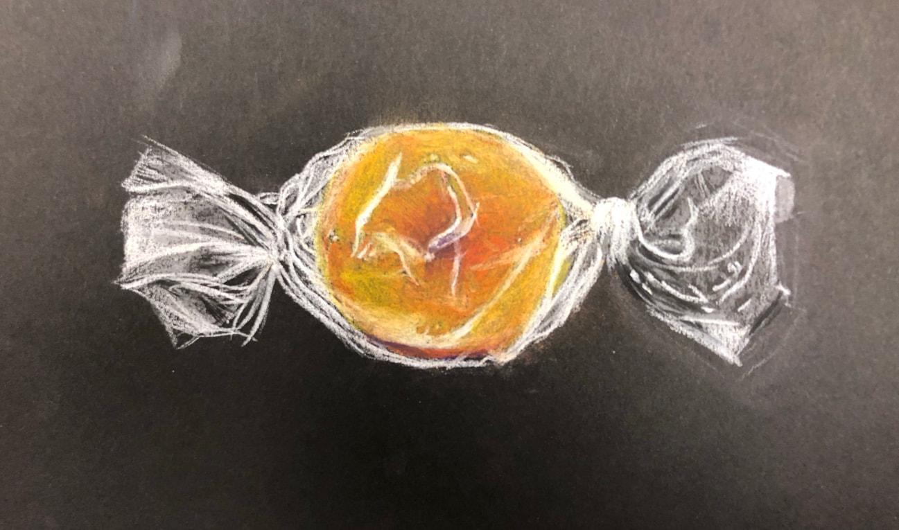
Candy practice drawing using pastel pencils, emphasizing the opacity of the wrapper around the candy.
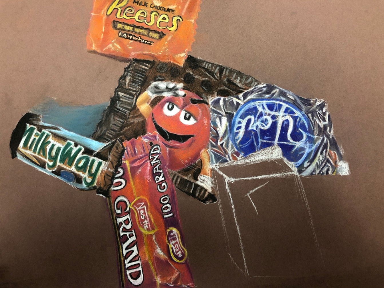
Final candy piece, random composition of candies photographed and done in pastel pencils, focusing on using contrasting colors to show depth.
Opacity project
20 ideas
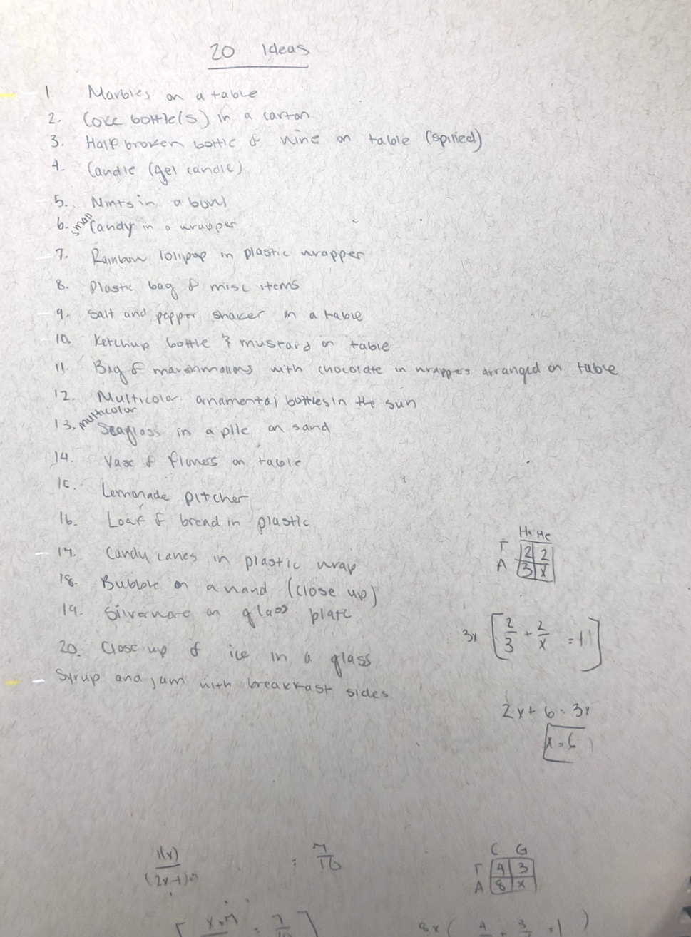
20 ideas for the opacity drawing. Focusing on creative options that don't revolve solely around glass.
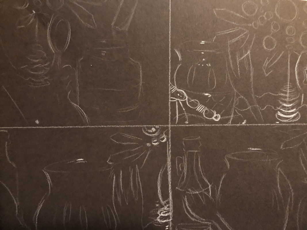
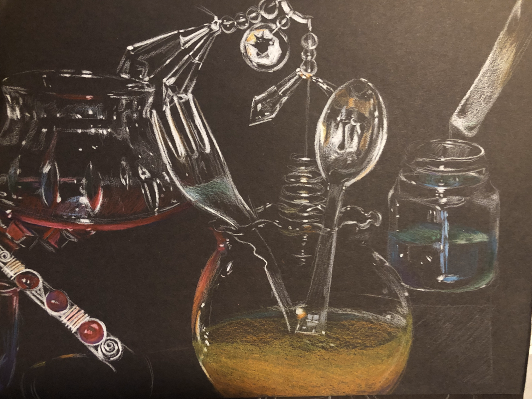
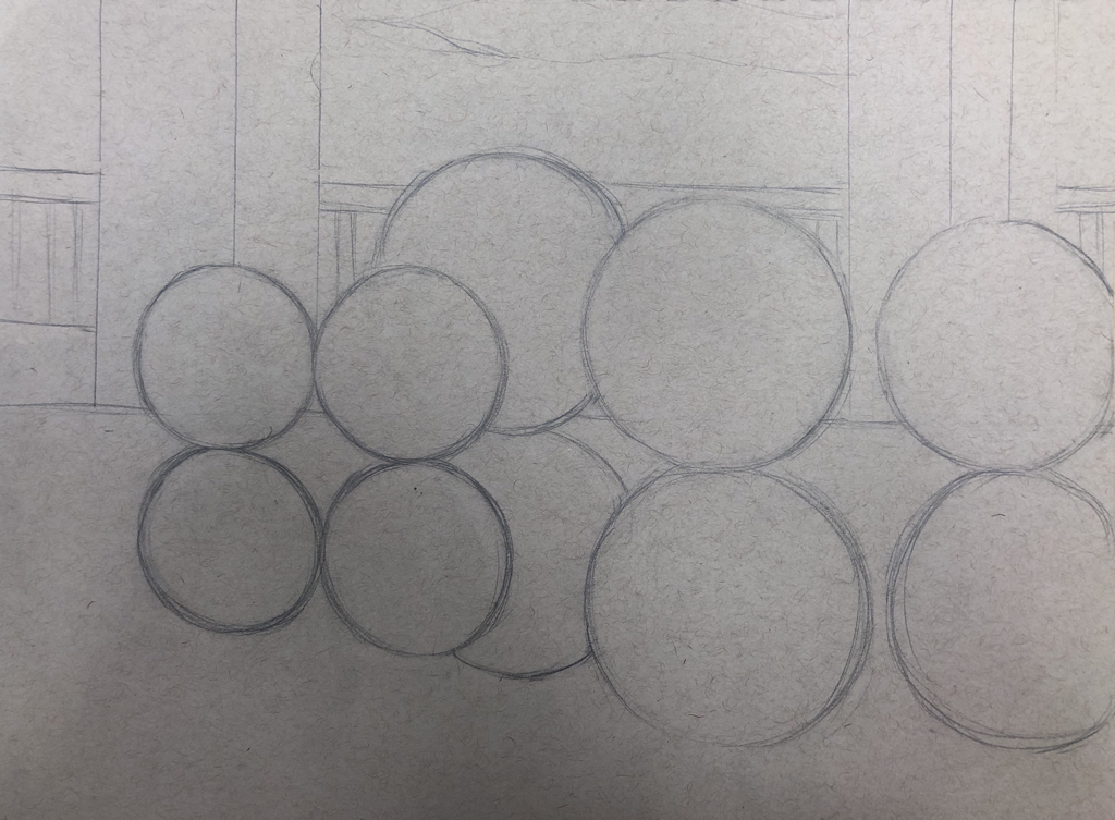
Compositional sketches (Opacity)
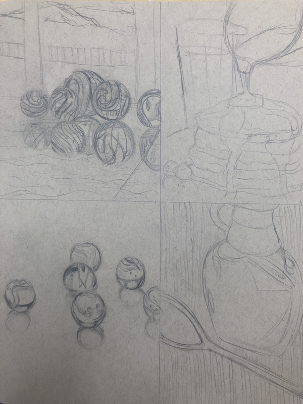
Composition sketches for opcaity drawing, exploring two different subjects of glass objects. Ultimately, the marbles of various patterns on marble countertop seemed like a fun challenge to take on.
Reference images

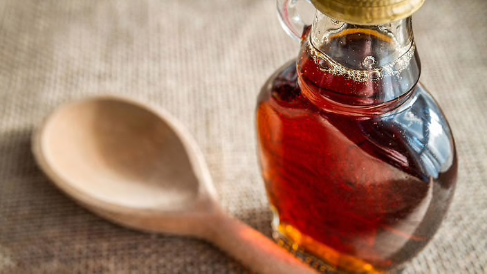
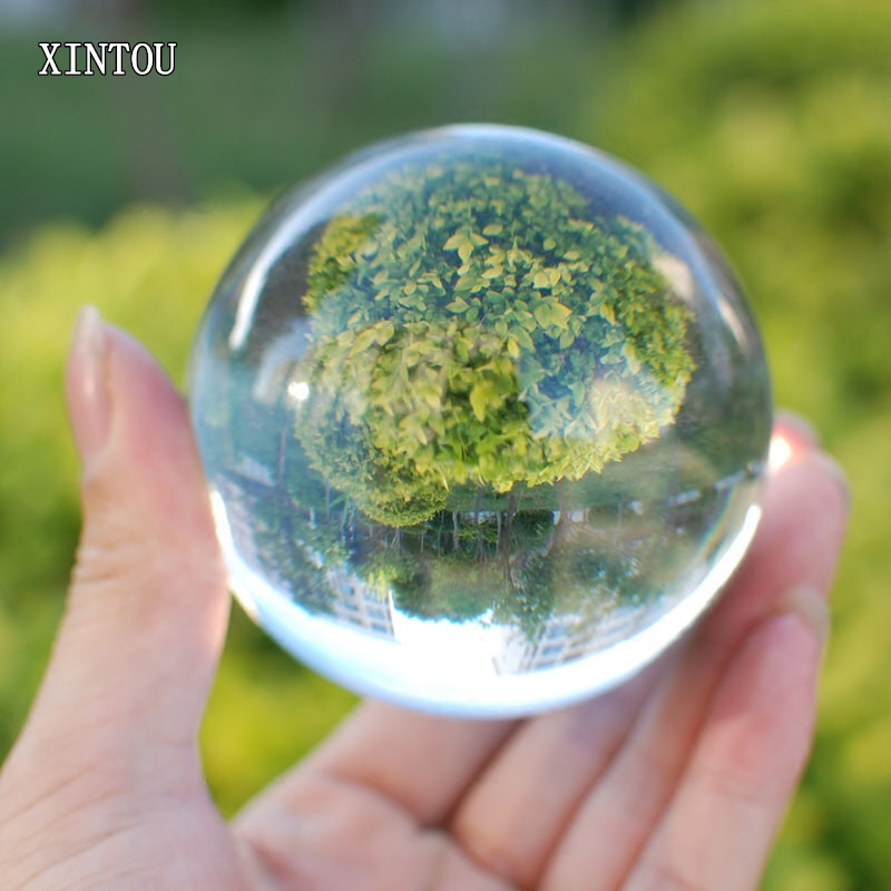

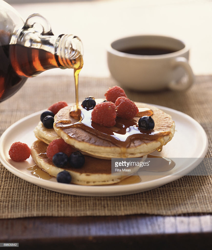

Reference images for opacity sketches.
Work in pRogress-Opacity
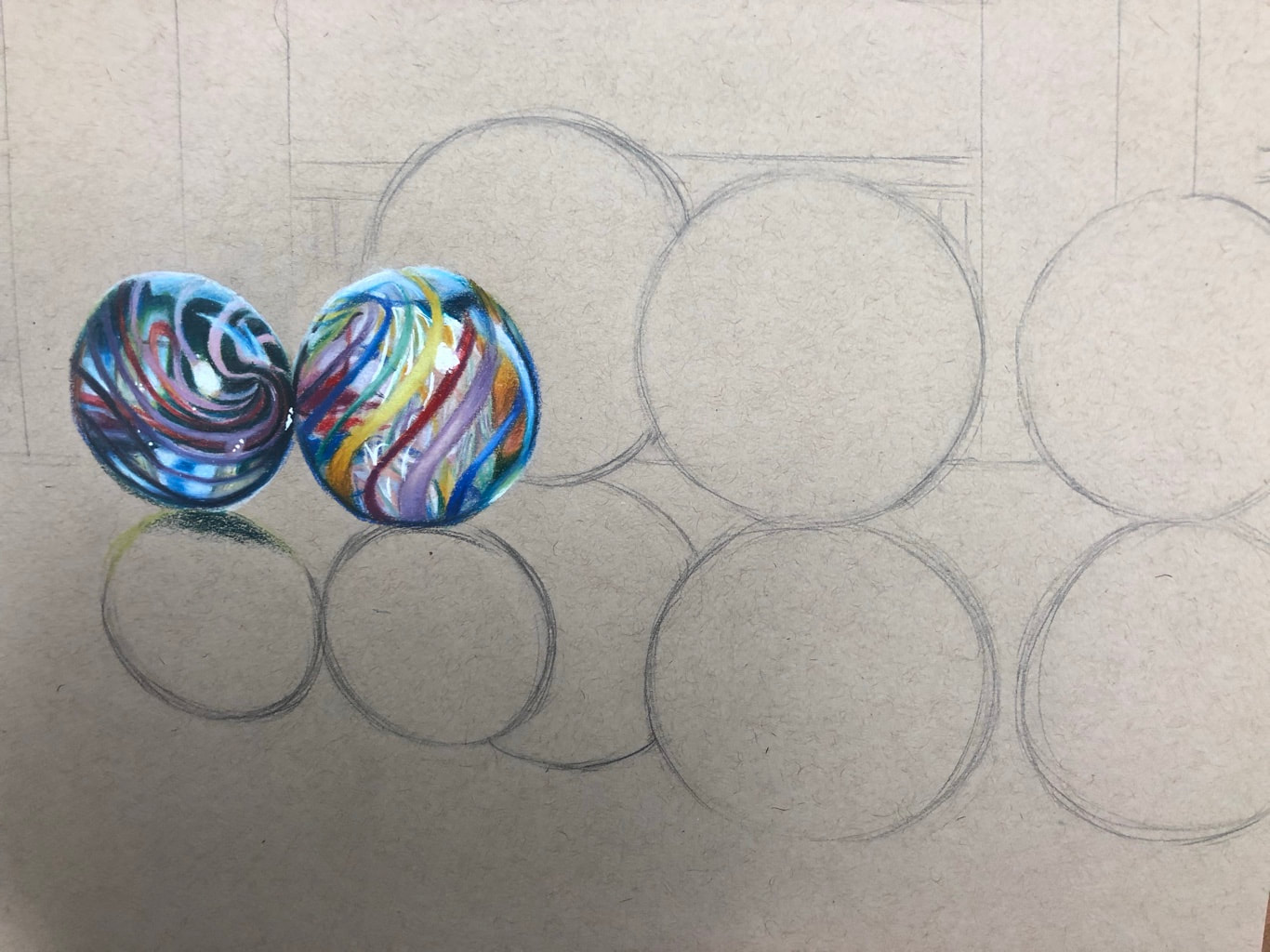
Initial sketch and process of drawing the marbles with Primas and Caran D'ache wax-based colored pencils.
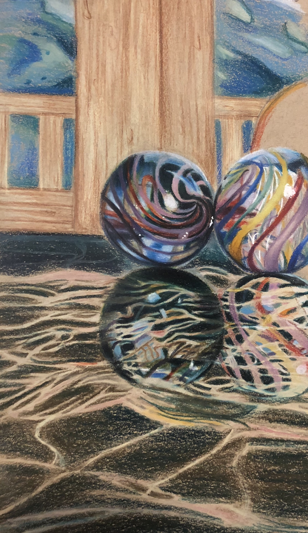
Opacity drawing
1. The craftsmanship is mediocre with my drawing. It is difficult to do detail with wax based colored pencils, hence the lines aren’t as fine as I would want them to be, specifically with the imperfections in the marble.
2. I chose this particular background because the marbles reflected a balcony with a view of a body of water and rocky forests, so I tried to recreate that to show the opacity of the marbles.
3. The colors I used are used to destinguish objects. For example, the reflection of the marble has a more greenish hue because the countertop is green marble. This ties all the components together.
4. I created contrast in the drawing by choosing drastically different colors to show a line. The counter is a dark green, which flows into the light color of the wood. But it is cut by the contrast of light and dark colors and a straight line.
5. I used textures to create interest in the drawing rather than having everything smooth and appear to be all the same materials. I used highlights and shadows to create depth and separate objects from one another.
6. I chose this particular background because it was reflected through the marbles, I made a loose representation of what I saw in the marbles reflections.
7. It’s important to understand how to use prismacolors because they are wax based. While they are easy to blend, it can be challenging when trying to attempt details precise lines. It is also important to know how to burnish and build up color to create an overall realistic effect.
8. The main difficulty I had was burnishing/time efficiency and detail. A lot of grain showed through the paper, and I wanted to have time to go back over it but I didn’t manage my time well, therefore it came out looking rather unrealistic. I also had a problem doing the details in the marble because the wax based colored pencils do not work in fine lines. Also, because they are so blendable, the imperfections in the marble bled into the green, somewhat ruining the effect.
*I forgot to take a picture of the final piece before it was put on display.
FACIAL STRUCTURE/FEATURES
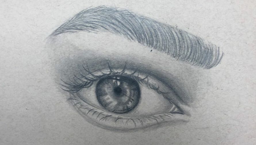
Eye sketch done in graphite, following a video tutorial from class.
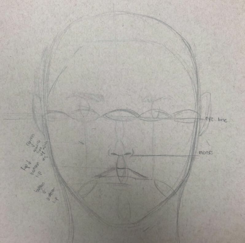
Facial placement sketch, establishing proportions and prepping for self portrait.
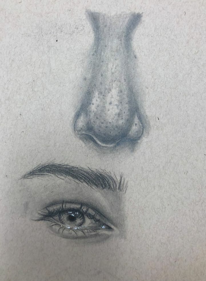
Practice for self portrait; sketching eye and nose from photo reference of myself.
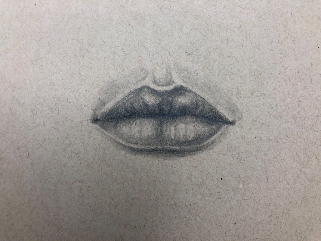
Mouth sketch following the video watched in class, focusing on values and creating realism through depth.
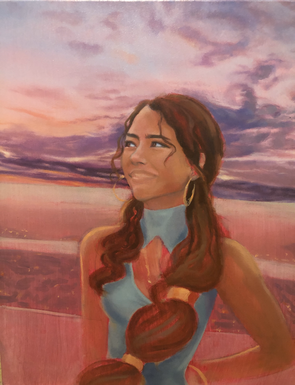
SELF PORTRAIT
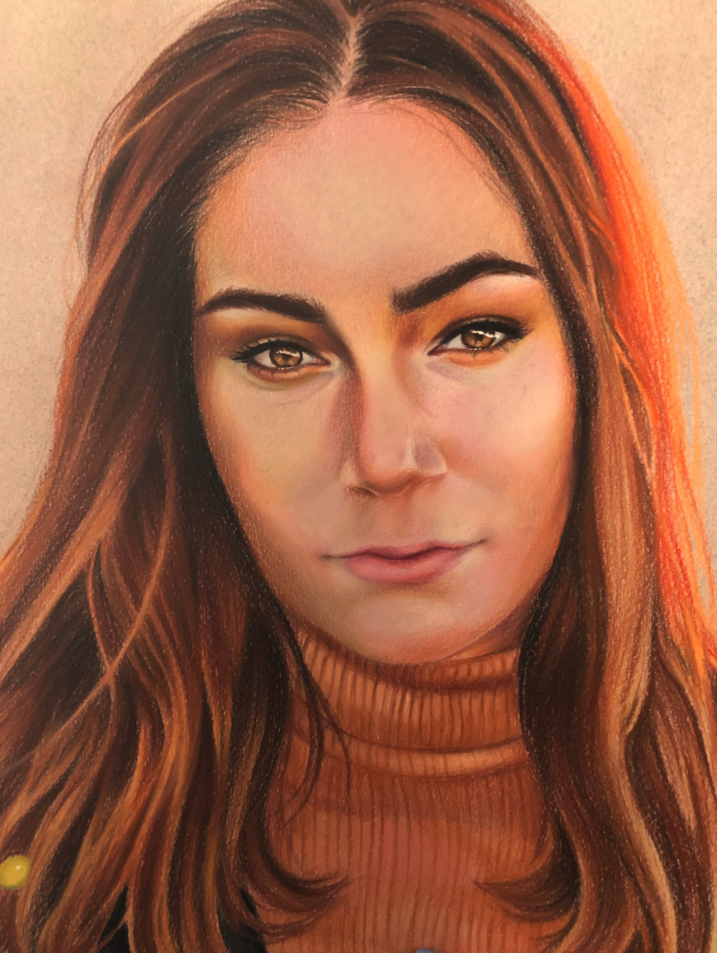
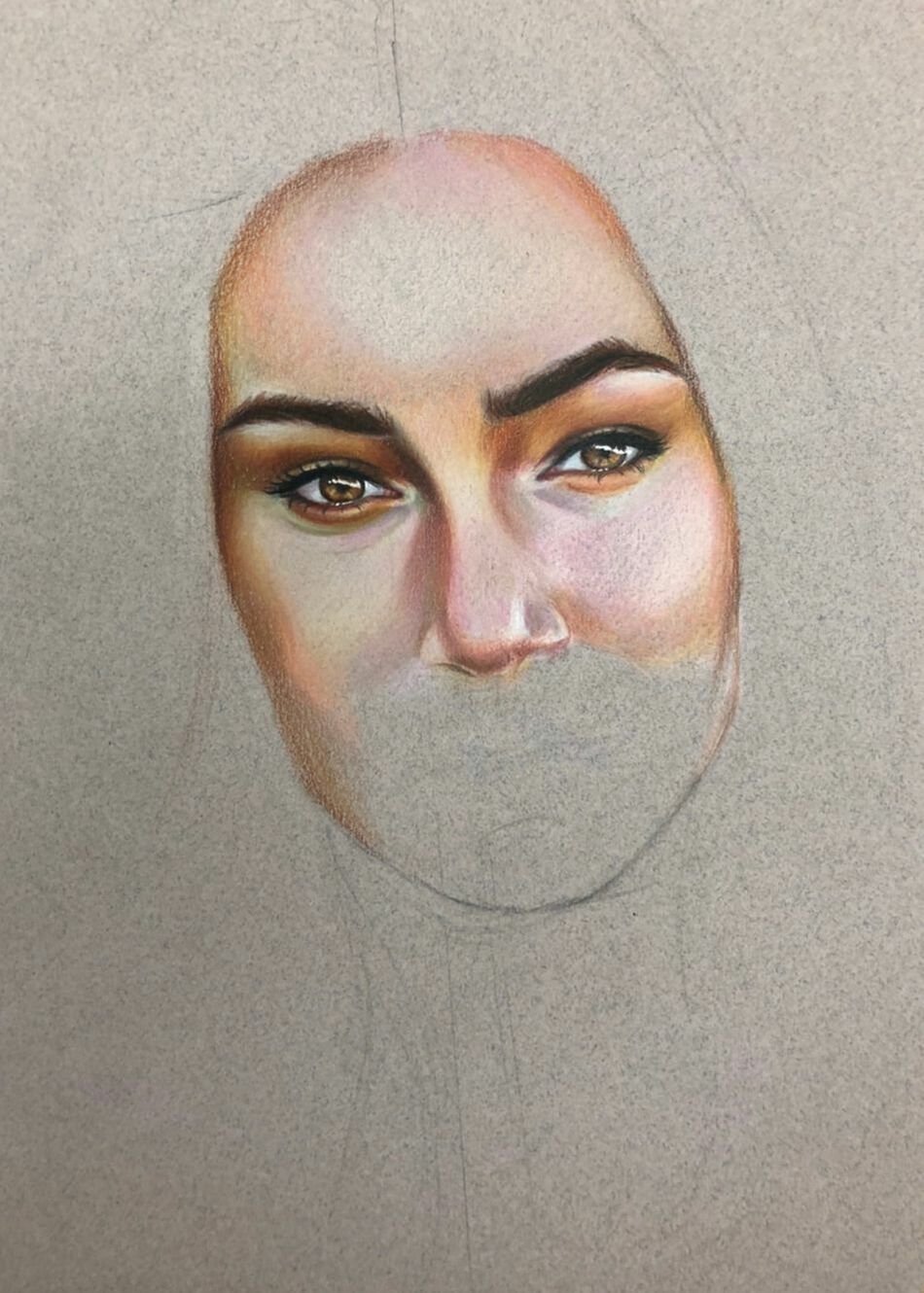
Self portrait using prismacolors and Caran D'ache wax-based colored pencils. Experimenting with unusual colors and focusing on realism in the piece.
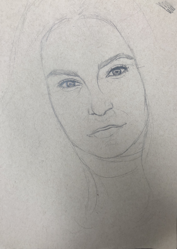
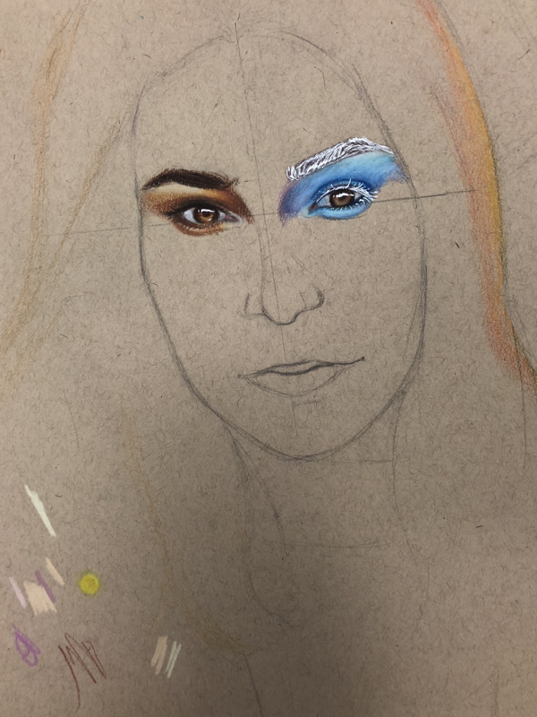
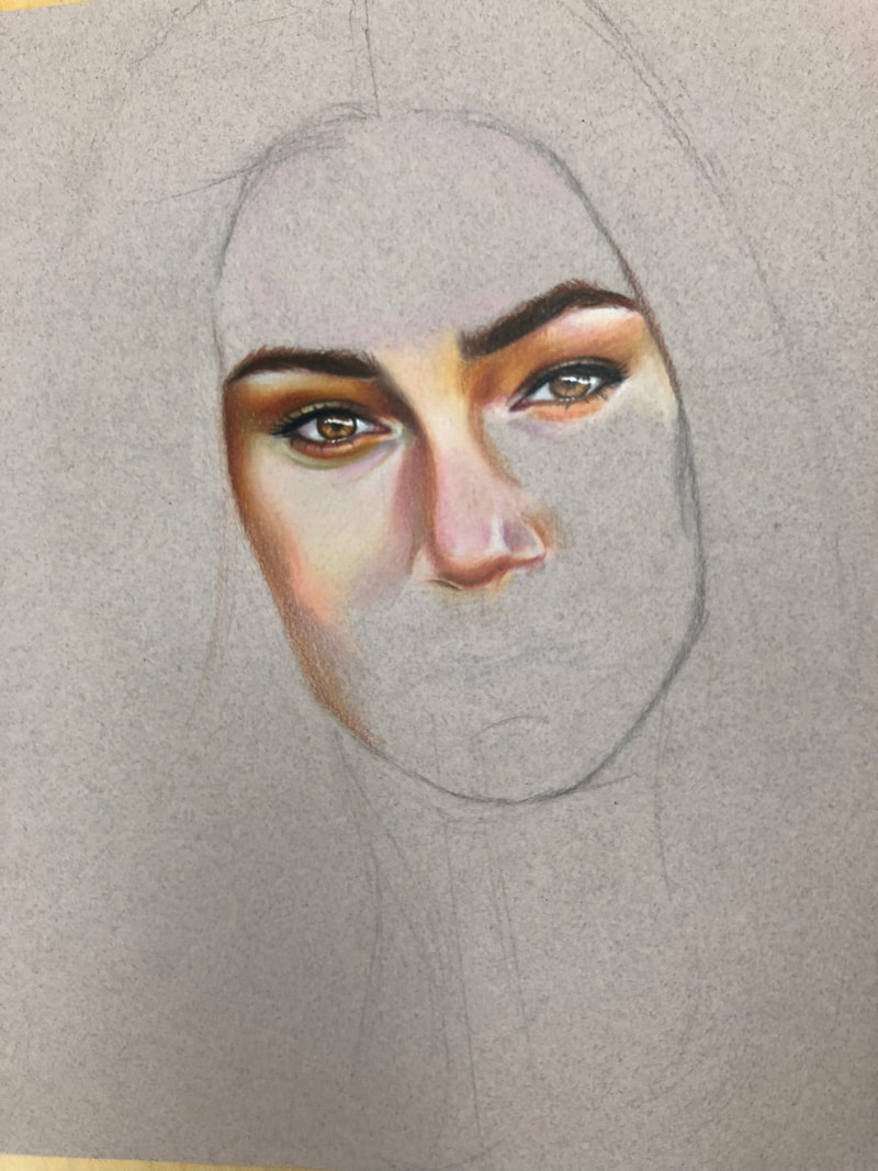
Sketches for self portrait, exploring different colors and practicing proportions.
1. To create this piece, I first came up with 3 unique portrait ideas. I wanted to explore with abstract concepts and the usage of unique color. I compared my ideas to photo references I have. Then, I sketched out these ideas and applied color. I evaluated which ideas captured the look I wanted to convey, then I used my photo reference to establish depth using values and colors.
2. I found different values in my portrait by analyzing my reference photo. The photo I chose has interesting lighting, which I thought would be a challenge to draw. I established these values by using my knowledge of color theory; I used contrasting and complimentary colors to indicate shadows and highlights, creating depth in my self portrait.
3. I did achieve a full range of values in my self portrait. I achieved this by starting with base tones and working darker to establish shadows, and adding highlights, which overall created depth in the piece. I also used unlikely colors to create an interesting contrast; like deep reds and oranges for shadows and bright yellows for highlights, to counter the basic skin tone colors.
4. My artwork is executed and crafted neatly because I spent the time to fully sketch out the piece and establish where the values will be. I used the wax colored pencil to burnish the colors and create an overall smoothness to the piece, which makes the piece appear more neat. The paper has more of a tooth to it so this was a challenge.
5. I think the crucial component to capture the look I had envisioned was the color. The reference photo featured bright, warm colors, as it was taken at sunset. I think this was the most appealing part of the photo, therefore I emphasized this in my piece. This was the defining element for the drawing.
6. I made sure I had correct facial placement by using the facial placement methods. As I sketched, I stepped back and compared with the reference photo as well. I compared the scale of the drawing to the photo and made sure the features were proportional. I also used the methods taught in class, measuring using eye-lengths to make sure the piece is correct.
7.It is so important to be able to draw the facial proportions correctly because otherwise the piece loses its realism. You want to be able to recognize your self-portrait as yourself, obviously, which is why it's important to achieve maximum realism when drawing your self portrait.
8. The most beneficial part of this unit was learning the facial placement measurements. This is the base to making a realistic self portrait, and without learning these things we would not be able to achieve the level of realism that we could with the notes we took on facial placement.
9.Obstacles I had to overcome:
1. Blending unlike colors
When coloring my piece, I tried to incorporate all the colors I saw in my reference photo. The effect of this was raw umber mixed with dark red, oranges mixed with browns. Blending these colors was harder than I anticipated, and between the colors was often patchy. I fixed this by using middle colors, or colors that could possibly between the two, and burnished until smooth.
2. Establishing the surface of the face
I struggled with shadows in the face, specifically around the cheeks, as too much shadow would make my portrait seem 40 years older. Without shadows, the face looks way too smooth, like plastic, making it very unrealistic. I also had trouble shading in unusual shadows, as it seemed out of place and it broke the overall smooth look of the piece. A great example of this is the shadow between the brow bones. The solution to this was to establish where I wanted the shadow, and then burnishing over it with a lighter skin tone, so the shadow was not harsh.
