First post
My goal for this class is to continue strengthening my fundamentals, particularly my knowledge of color and perspective. To accomplish this, I will:
- Practice practice practice!
- Ask for (and listen to) constructive criticism
- Actively think while I work, instead of arting on autopilot
Introduction photo
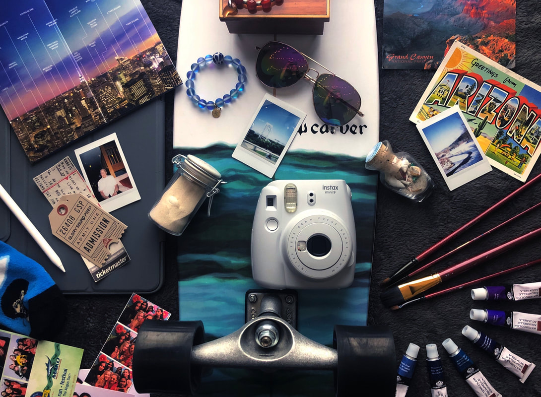
For my introduction photo, I wanted to find a variety of thingamajigs that have significance to me, but also went together aesthetically. I started by thinking about what was important to me, and I decided on a few major themes: friends/family, art, and traveling. I then went and found whatever I associated with those things. At the top left, I have a brochure I picked up when I was visiting NYC in September 2019. I actually picked it up from the Freedom Tower on 9/11, which was purely a coincidence, but the weight of being there had a huge impact on me. On a more positive note, I adore the brochure because it's a 360 view of the New York skyline, and it even has a day version on the backside of it. Anyone who knows me knows I love watching the sunset, and seeing this brochure reminds me of good memories in NYC. I love the city so much I might even go to college there, so I had to include a little something about that. Below that is a picture of my grandpa I took on my polaroid (he's the light of my life), and some tickets for a Jon Bellion concert I went to in summer 2019. It was my first ever concert; me and my friend went and I cannot stress how much it changed my life. I want to go to concerts forever now, the energy is incredible. Underneath those I have my iPad, which represents my obsession with art, and then a Bob Ross sock because he gives me the strength to do art when I'm too frustrated, and then below that are some photo booth pictures with friends. The longboard in the middle represents my second hobby, which is skateboarding, which also happens to remind me of skating with friends. On top of the skateboard is an Italian music box from Italy, which was a gift from my family. The red bracelet that's barely out of frame is also from Italy, and I cropped it out but there's also a silver necklace from Italy on top of the music box. When you shake the pendant, it makes a sound that is supposedly like the voices of angels. That little story behind the necklace brings me joy. I got the blue bracelet in Cancun; me and my best friend went together in 2018, and we got matching bracelets. I adore the way it refracts the light, it reminds me of the stunning ocean in Mexico. Below that is my polaroid, and then scattered about are little jars of sand that my best friend gives me when she travels. My family never travels, so my friend brings me back little souvenirs from her trips. Similarly, one of my friends gives me postcards from wherever he travels, and he writes little details about his travels on the back so I can be apart of the fun too. He knows that I desperately want to take a road trip out to the west coast, but since I can't rn he buys postcards to cheer me up. Lastly, I included some brushes and watercolor paints to strengthen the composition and to unify the color scheme a bit more. It also represents my love for art!
Exam
Beginning of class
End of Class
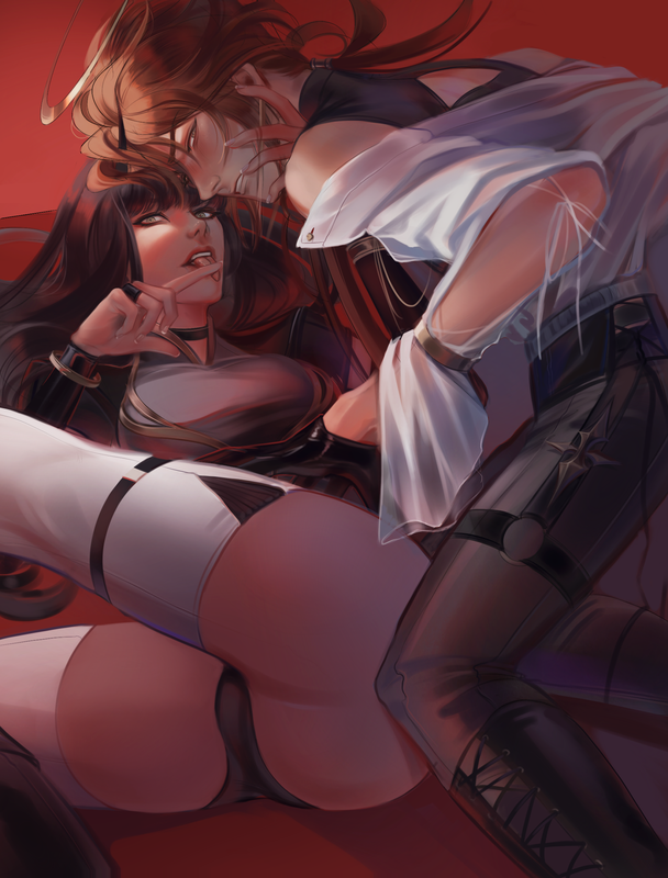
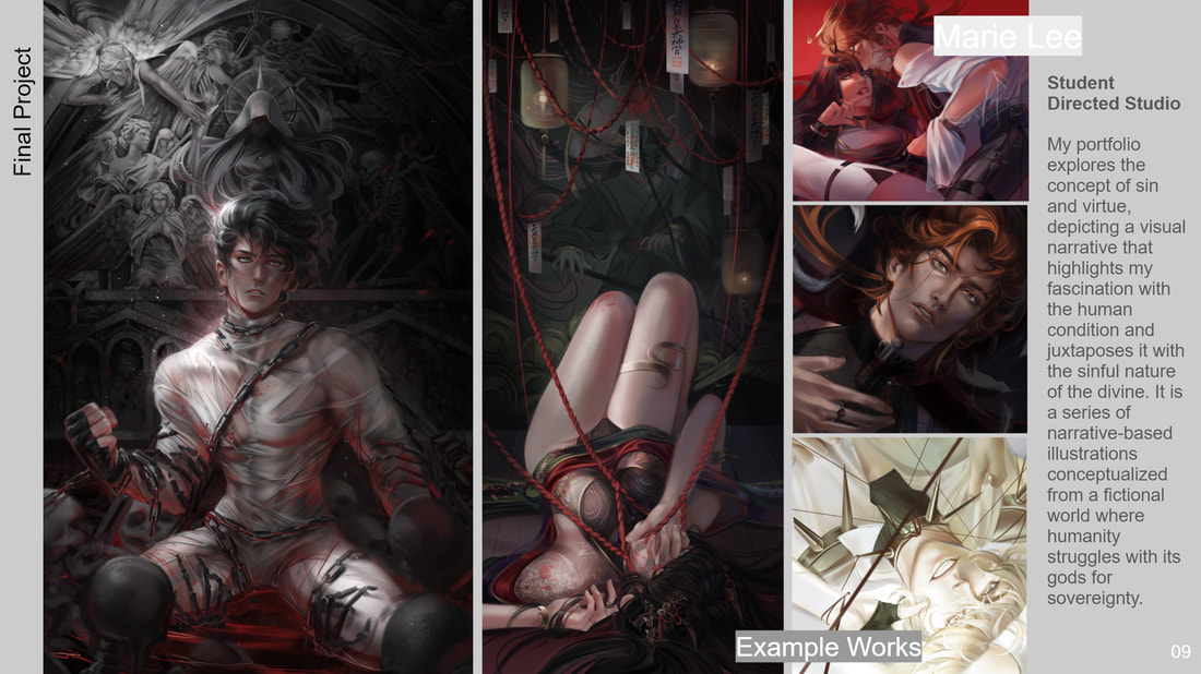
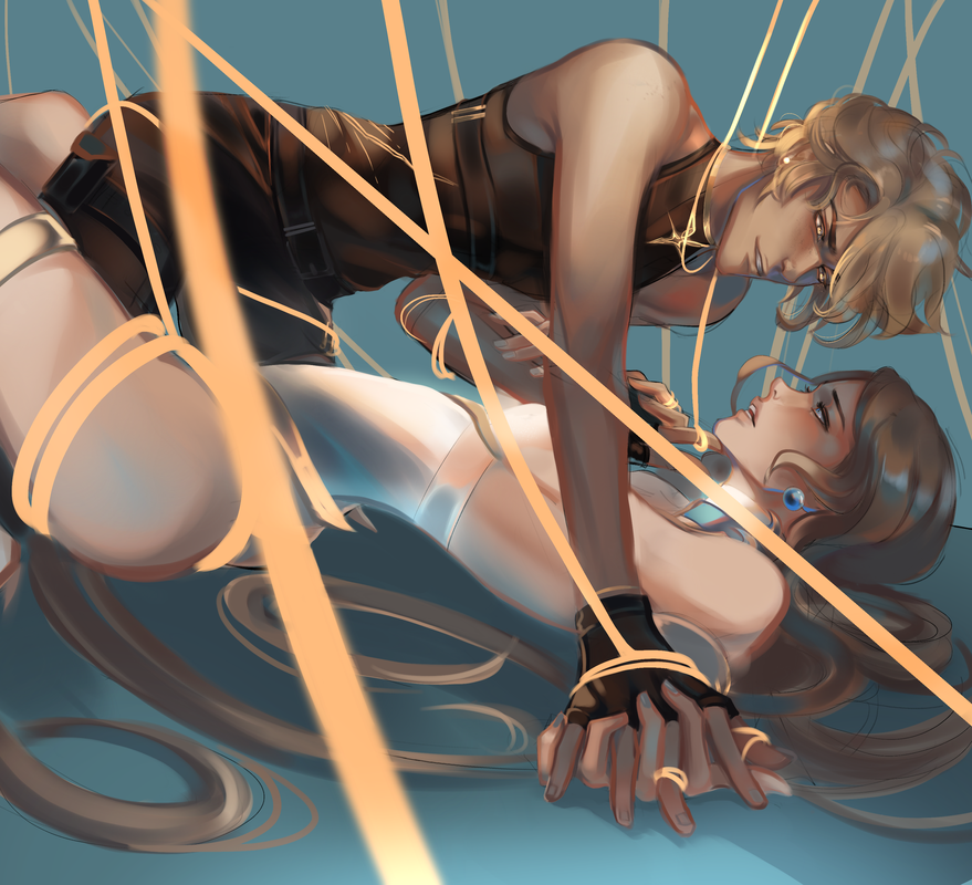
A) Throughout this class, I was really interested in exploring 'poster'-like illustrations that focus on visual clarity, strong/unique color choices, and disorientating perspectives. I was captivated by this concept of a vivid, solid background, paired with unique character dynamics. The key of these types of illustrations was to challenge how I approach rendering; with a saturated background, it affects how other colors appear when put against that strong primary color. I had to include accents of the red background into the skin, hair, etc. just to make it appear natural. For example: the skin appears to be in normal tones, but in actuality the colors are in deeply saturated pink, red, and purple hues.
B) I chose digital art as my media for the final project. This is my strongest medium, but it is also the most viable for the kind of look I wanted to achieve. Digital allows me to make countless revisions, which was necessary for this piece because of its complicated nature. I actually redid the entire piece to capture my vision properly. Additionally, the digital medium allows me to mirror the look of game art, which is a large goal of my work. This amount of visual clarity, particularly in their faces, is only possible with a medium that has zero repercussions for painting areas multiple times.
C) These pieces are only a few months apart, but the difference in quality is quite significant to me. The piece I made at the beginning of this class signifies a dramatic shift in my style and interests; prior to these projects, my style aligned more closely with painterly realism, with an emphasis on implied detail and capturing the essence of reality. A painterly style is my comfort zone—I always go back to it when I want to free my mind and paint with my heart, but there has always been a part of me that yearned to do something polar to normality. I wanted to do something strange, something breathtakingly eye-catching; but create a cohesive piece of this nature, I had to learn to balance the chaos with a simplified style. The piece I did at the beginning of the year was my first attempt at this; I explored a semi-realistic style with influences from Japanese manga/anime, and tried to develop a simpler approach to rendering that utilized unlikely accents of strong colors. Ironically, this was way more complicated than my endeavors in realism, because our brains don't naturally function in this way. It's easy to perceive reality and replicate it, but it's nearly impossible to defy it and create something entirely fictional and distinctly yours. My struggle is evident in the first piece: I didn't know how to properly balance my desaturated tones with the strong color accents, my perspective was off, etc.. It just didn't have the impact I was yearning for. My brain practically melted trying to undo the fundamentals that were rigidly drilled into my head throughout high school. I was so stuck, but the first piece wasn't necessarily a failure; I had learned a lot from the experience, but I was lacking the skills to properly execute my vision. My final project is the result of relentless learning and drawing (nearly 600 hours for my AP portfolio!), and while this piece is not perfect, I feel like I'm so much closer to achieving the desired look. Despite its flaws and controversial subject matter, I love this piece—which is pretty rare for me. I love how crisp the area around the faces look (though I wish I had a bit more time to polish the rest of the piece in the same manner). I love the colors, the expressions, the disorientating perspective, and the overall cohesiveness of the piece, which is something I've struggled with in the past.
End of year slide