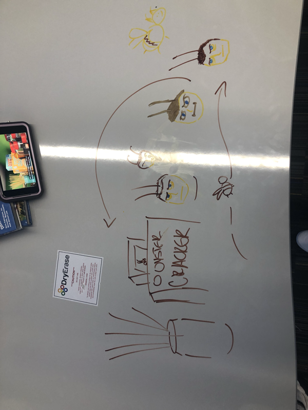
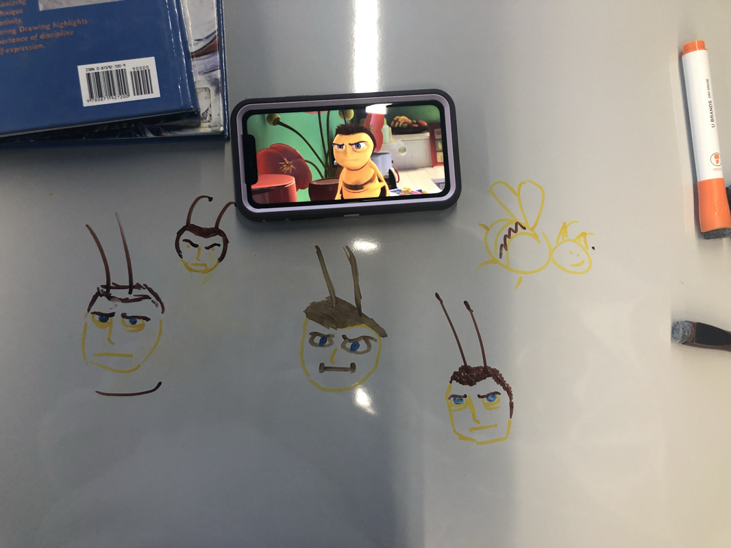
Stop motion Rough sketch ideas
Reflection:
1. I worked with Jordyn.
2. I found that maintaining the volume/size of objects was really hard. The bat kept changing sizes throughout the animation.
3. I think towards the end of the animation the pictures got more consistent and the animation flowed better. The idea was really fun and I think it eventually came together.
https://www.youtube.com/watch?v=qVf8aH-BeaU
Word of the week-criminal
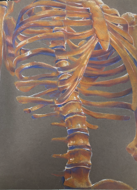
20 min sketch on procreate
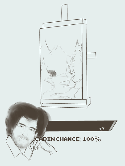
WorD of the week- cabIn
40 minute sketch on Procreate.
Clones of me proJect
Reflection:
1. The biggest problem was that the sun was behind a cloud for the first three photos. The sun came out for the last photo and it looked much brighter than the background. I tried to overcome this by changing the brightness and the saturation so it would match the other three.
2. If I could change the piece I would've retaken the last picture (far right), because even though I tried to fix the lighting, it still looks out of place.
WorD of the week- Future
50 minute sketch on Procreate
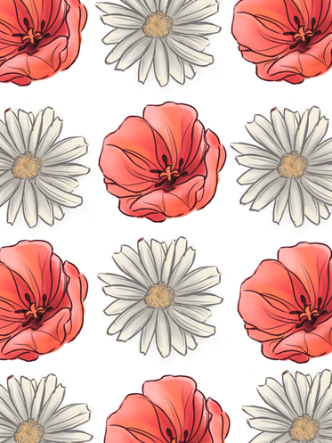
Surface pattern design
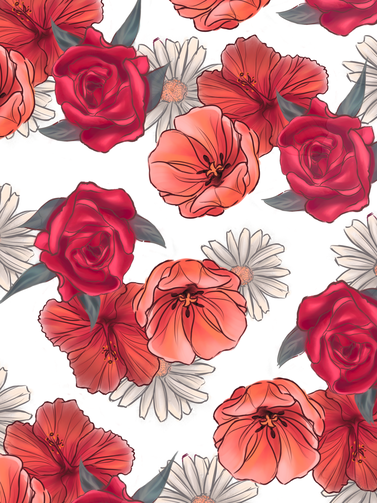
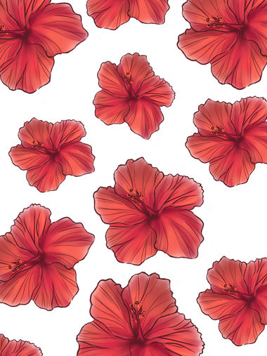
Reflection:
1. My theme was flower-orientated because I wanted to do some watercolor-esque flowers. I really liked the idea of bright colors and cute patterns.
2. My favorite pattern was the third one because I feel like the tulip and the daisy compliment each other really well. The pink and the white is soft on the eyes.
3. I found it really difficult to put all 4 of my objects together into a cohesive pattern. The colors and shapes didn't really flow together.
4. I would recommend to someone starting this project that they think about what kind of shapes and colors would go the best together in their showstopper pattern. I would also recommend making the objects as big as possible, so when you change the sizes it doesn't get all pixelated.
Word of the week- Translucent
Word of the week- Dream
1 hour sketch on Procreate
Word of the weEk- History
Word of the week- iDentical
State fair posTer
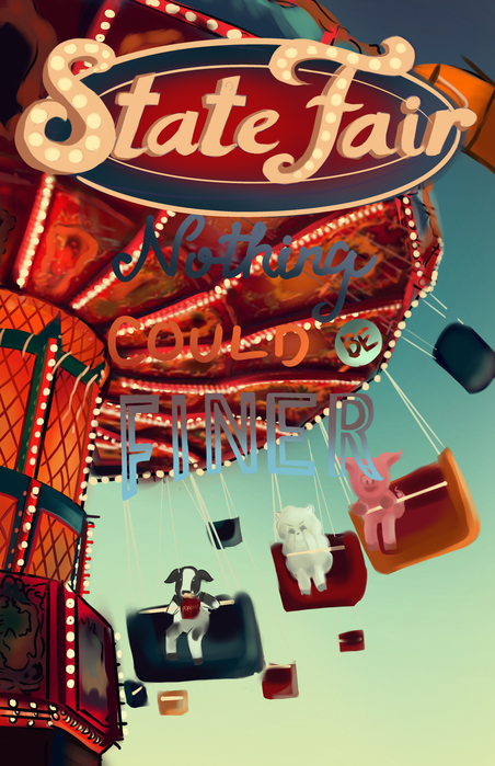
This project was really challenging for me. I had an idea and I didn't have any idea how to execute it, and I think that shows here. However, I am proud of the colors and the lettering,
- Pros:
- Colors turned out well
- Shapes clear
- Lighting and image clear
- Cons:
- Rushed = messy
- Disorganized
- Animals look out of place, I wish I had taken the time to refine them
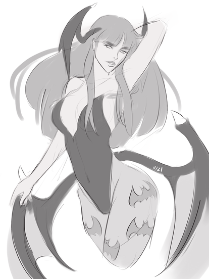
Turn Around Project
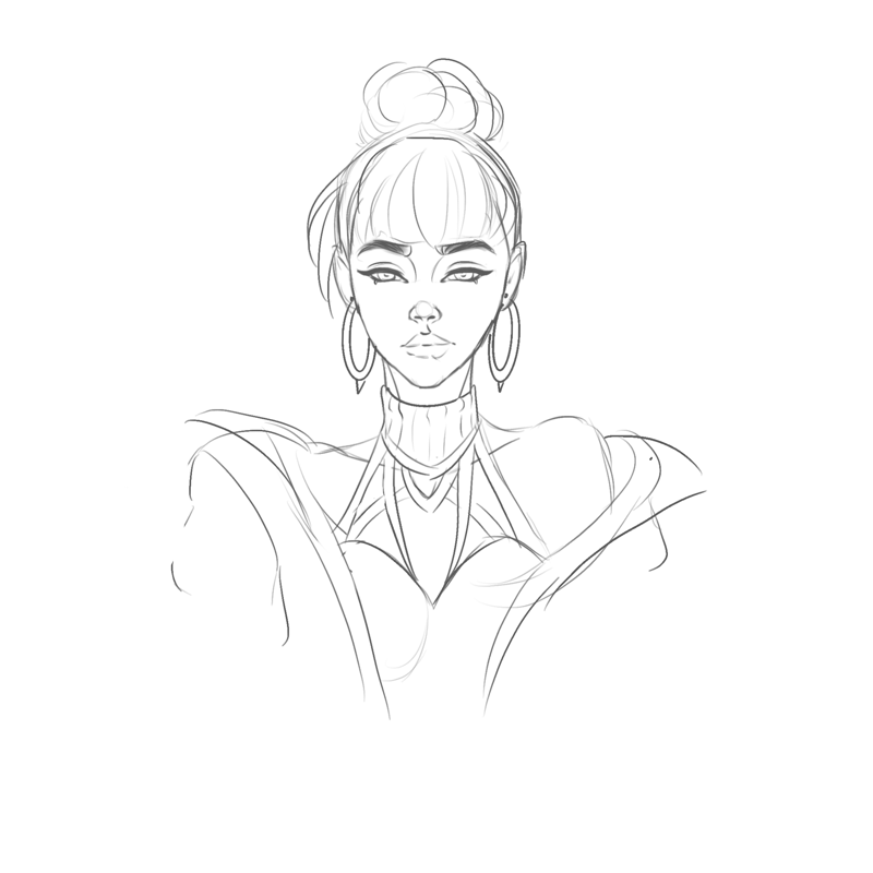
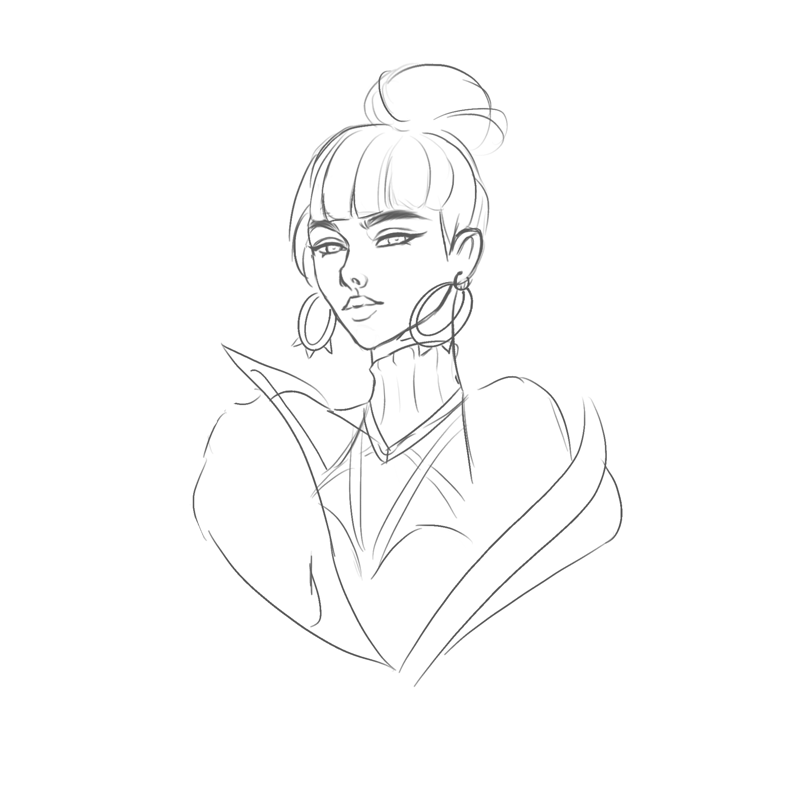
- This project turned out to be really fun. I originally wanted to do a more complicated piece but it ended up taking too much time, but I think this rough sketch animation turned out really cool! I didn't expect to like animation as much as I did.
- Pros:
- Animation looks relatively consistent, no drastic changes in the size of features/outfit
- Her design was really fun to sketch out
- Cons:
- Could have been more refined. Messy and sketchy
- FlipaClip kinda ruined the quality
Illustration moNday-11/4
Halloween
Creature feature project
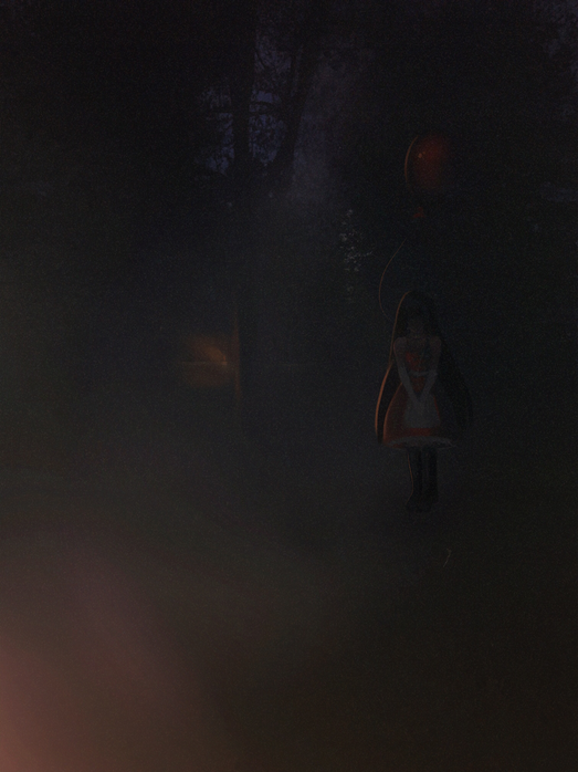
-The photo is from Sud's backyard, but I edited it to remove the halloween decorations/houses in the background. I wanted it to look like a dense forest in the background rather than a neighborhood for extra creep factor.
-Rarely caught on camera, the red balloon girl is rumored to have been presumed dead after wandering off on a family camping trip. The little girl, scared and alone, wandered the dense forest in search of help, but found nothing. Likewise, her body was never found. The legend goes that she sometimes appears to drive campers away from their sites so that they face the same trauma she felt, never to be found again,
-I started this piece by copying the right portion of the forest and putting it over to the left to hide the neighborhood in the background. I then blended the two together and added some texture for the missing branches, and I further increased the fog-flash effect thing in the bottom left corner. I then painted the campsite in the background and added some lighting to the surrounding forest, added the girl, messed with the layer types (highlight, overlay, etc.) and finally lowered the opacity before adding a vignette effect and static overtop.
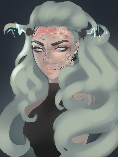
Word of the week- 11/7 Brain
Word of the Week 11/21 - Monster
Animal Project-
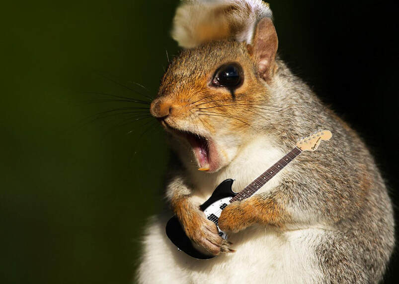
1. I couldn't figure out how to match the orange tones of the squirrel fur with the koala's bluish ear fuzz. To overcome this, I used the clone stamp tool.
2. If I could change anything about this piece, I would add a bit more texture in his little koala mohawk.
3. This cute little rockstar is a Chippunk- a squirrel, chipmunk, and koala mix with a mini electric guitar. Rock on. I originally wanted to put koala ears on a squirrel, but when I saw this picture of a screaming squirrel it all came together.
Word of the week- Magical 12/12
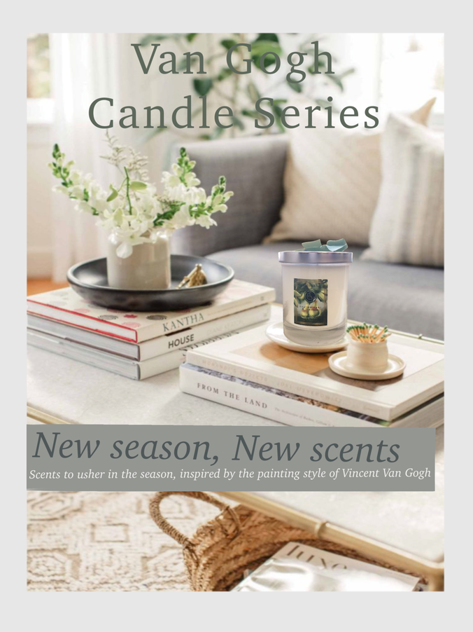
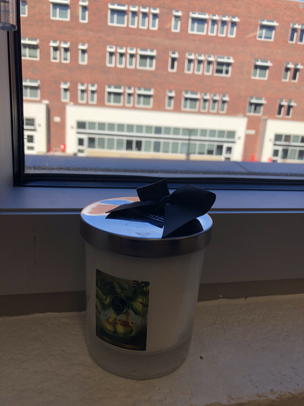
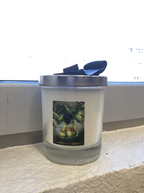
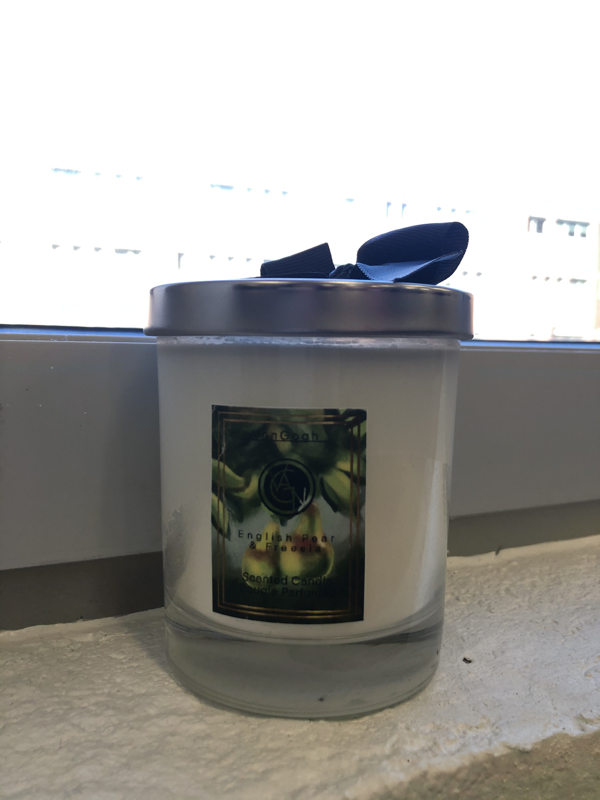
Product Design- Van Gogh Candle
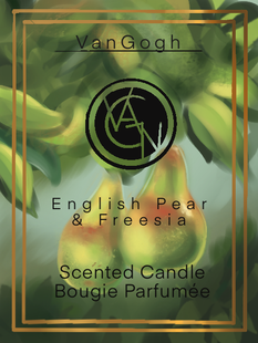
1. I picked a candle to redesign because I really liked the graphic design on the label. I thought the gold frame would be interesting to replicate. I also had the idea of making a visual like "aid" to a candle.
2. I wanted the illustration on the label to match the smell of the candle. For mine, the original smell of the candle was english pear, so I painted a cluster of them in vibrant colors. The vibrant colors form a positive connection with the candle so it would hypothetically market better. I had just finished a visual analysis of "The Sower at Sunset" by Vincent Van Gogh for another class, and I was inspired by his style so much that I applied it to my candle label illustration.
3. I think that the colors was the most successful part of my design. I think it achieves the Van Gogh aesthetic, with purposely vague brush stokes and vibrant colors. I did not like it at first, but once it was printed and I got to actually put it on my candle it looked really nice and cohesive. The contrast of the warm yellows and oranges with the pure white was very aesthetically pleasing.
4. If I could change anything about the piece, I would change the dimensions of the label. When I designed it on my ipad, it looked a lot more detailed and cohesive. When we had it printed, it was smaller than I expected and it lost some of that necessary detail.
Magazine ad and final prOduct
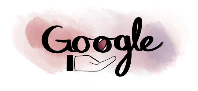
Doodle for Google
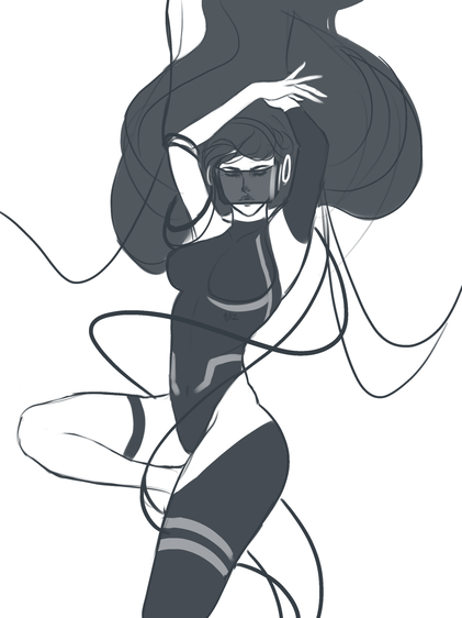
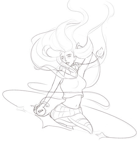
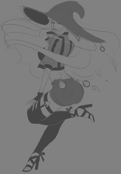
COMPUTER ARTS FINAl Animation
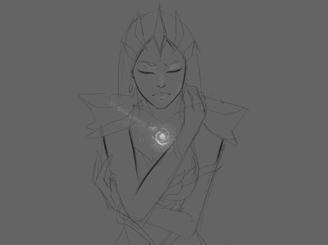
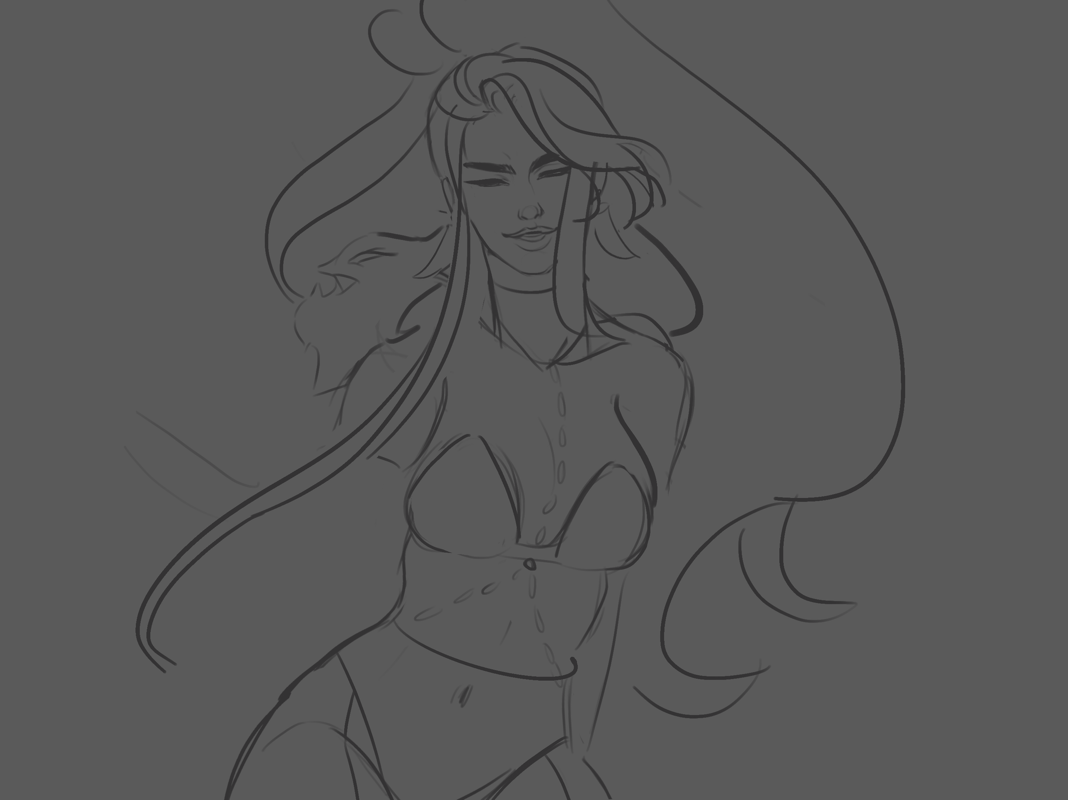
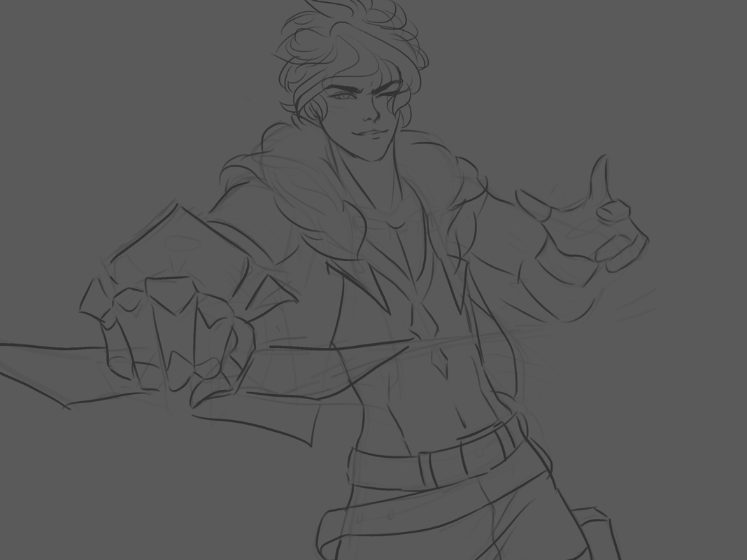
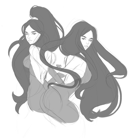
1. Explain your original idea and how it might have changed. My original idea came from the concepts going into my college art portfolio. Since I want to go into concept art and illustration, part of my portfolio requires a variety of character concepts. I'm currently working on a character archetype line up, and I wanted to use my animation to showcase some of their story and further branch out my ideas. The animation made sure the line up and their respective backgrounds were cohesive and the designs were solid. It changed slightly as I ran out of time...I had originally planned to explore each character's background, but I just ran out of time, so there's a brief look at the rest of the crew towards the end.
2. How did you make your animation? I used Procreate for my animation. I knew I wanted to use digital tools for this project after I experimented with flip a clip during the turnaround project. Procreate recently added an animation feature to its program, and since I'm already well versed in the program, I knew I had to try it out. My only gripe with the program is that the max frames you can use counts for the max number of layers, so you can only have around 100 frames. It depends on the size of your canvas, but mine was limited to 91 frames.
3. What was most difficult for you? The most difficult thing for me was drawing the movement and switching of perspectives. I have never animated anything before, and I noticed that a lot of animations stay in one or two perspectives for a good amount of frames. Now I understand why!! Illustrating the moving, camera-like perspective while my character was also in movement was nearly impossible, and making the movement look smooth was even more difficult. I don't think it turned out the way I wanted to, but the idea shined through; it was really exciting for me to see my concept come to life.
4. What did you find most successful? There's a scene where my character, Alanna, is walking along the kingdom army. She takes her cape from the extending hand of a knight. I had no idea how to capture this in the beginning, so I just started out by drawing shapes. When I played the clip, it blew my mind. Though it was just blocks and lines, I could tell exactly what was going on and it really captured the movement I had initially visualized This, along with the movement of her hair, were probably the most successful aspects of my animation.
5. How did you prioritize your time? I honestly don't think I used my time efficiently. I got distracted often in class, and as a result my finished animation was not as detailed and clean as I originally imagined it to be. With the time I did have, I began by drawing out the line of action and basic shapes. I did this for the entire animation, and then went back and starting adding in the details. I spent the most time on the first 10-20 seconds of the animation, evident by the detail in each of the frames. It was generally easier for me to flesh out these frames because there was no change in perspective. I used the basic detail of her face and animated the surrounding features to show movement.
6. Can you site 6 different principles of animation? I know that in my animation I used at least six of the principles of animation:
- Appeal- I designed Alanna to be likable by a variety of audiences. Her design showcases a variety of contrasting shapes: her shoulder plates are sharp and defined while her face is round and feminine, etc. I did this to show her as an young and naive girl forced into the role of a well rounded, fierce general. I wanted her design to match her inner conflict, which can hopefully feel relatable for the audience.
- Squash and Stretch- I used squash and stretch in Alanna's hair to show movement and make the environment feel more lively. Additionally, the squash and stretch motion shows the volume and weight of her hair (it's a lot of hair)
- Pose to Pose/Straight Ahead- I used pose to pose to animate Alanna walking down the aisle, and I used straight ahead to animate the hair and the cloth movements. The hair and cloth had no structured movement because they could essentially take any shape, so I had the most fun designing the shapes for that. I used pose to pose for the shots of Alanna walking so that the end product looked accurate and polished.
- Anticipation- I used anticipation in the moment before Alanna walks away from the balcony.
- Secondary Action- I used secondary action in the frames where Alanna is walking. The primary action is her legs, while the secondary action is the surrounding appendages; arms, hair, and cape movements.
- Slow In and Slow Out- I used slow in and slow out when Alanna turns around. I tried to make her turning her head look natural, not robotic. I used three key frames and added slightly skewed drawings inbetween. Because the movement is relatively quick, the action does not appear too choppy.
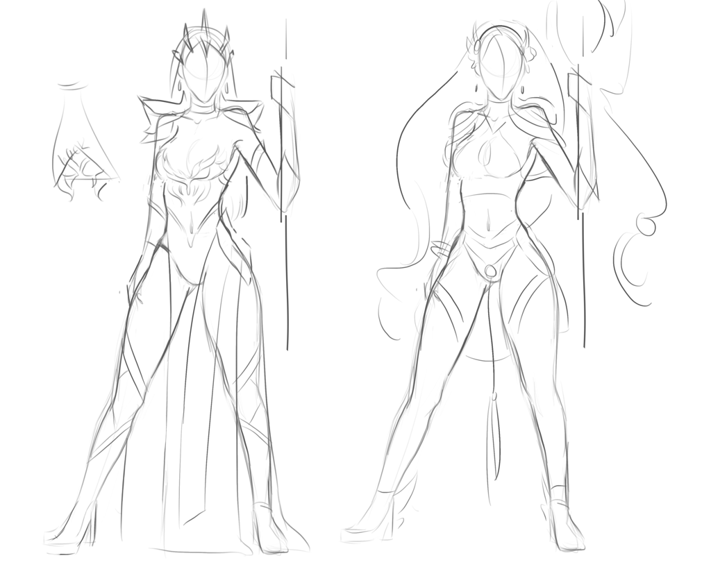
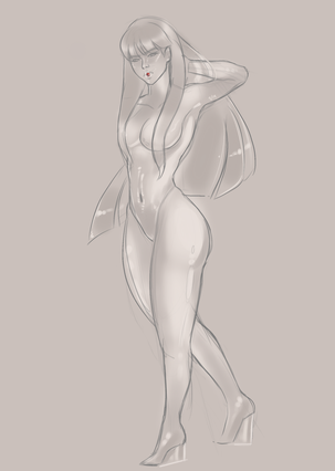
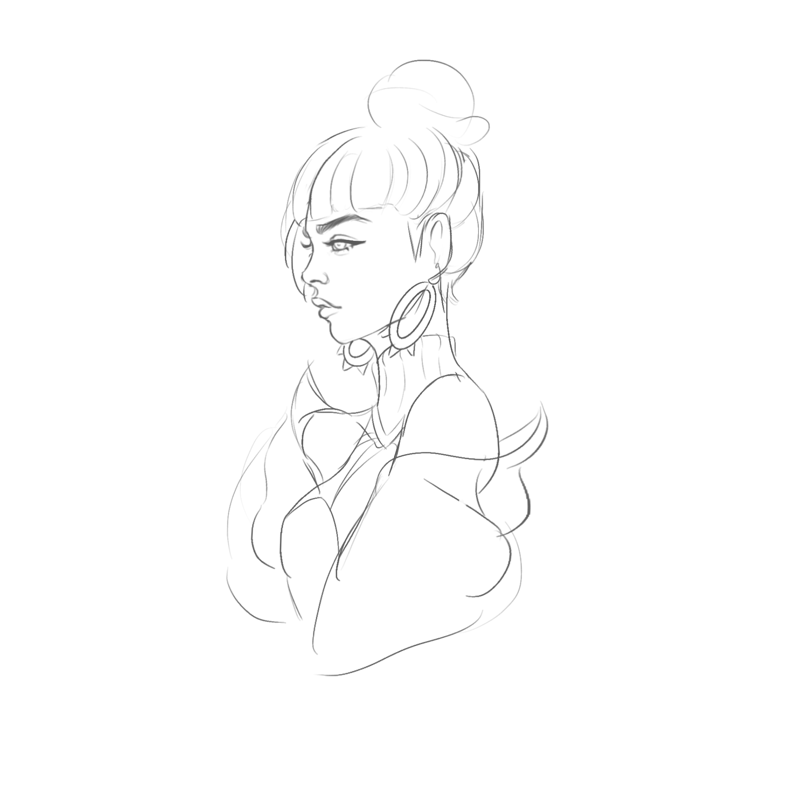
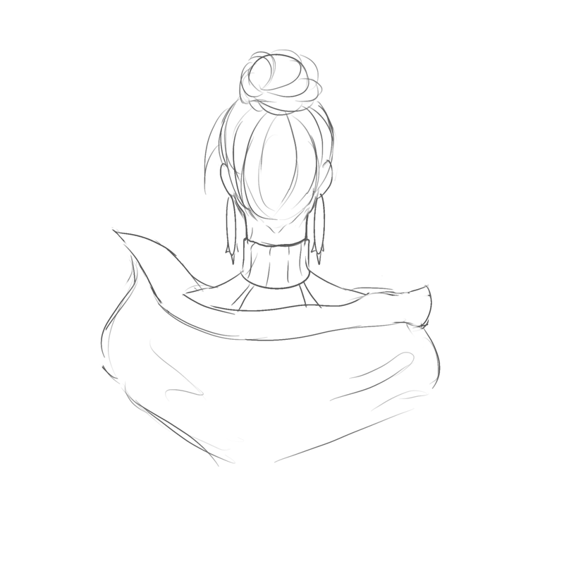
Outfit concepts
Disclaimer: I couldn't figure out how to get the song I wanted to work, but the animation is supposed to go Butterfly by Bassnectar.
Quality is ruined, so here's some stills!
Quality is ruined, so here's some stills!