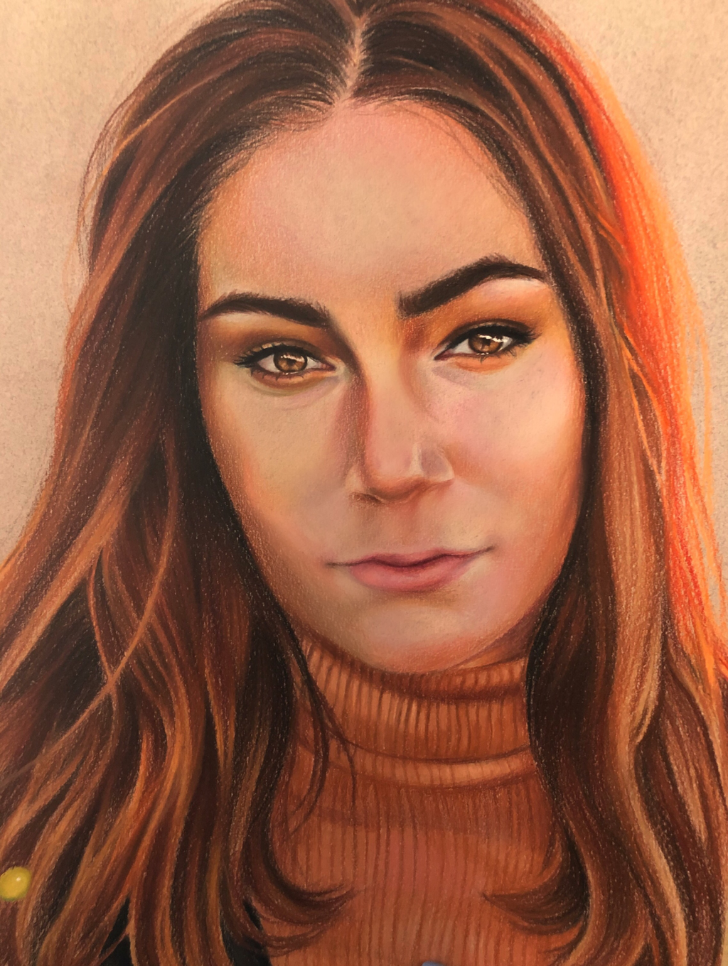
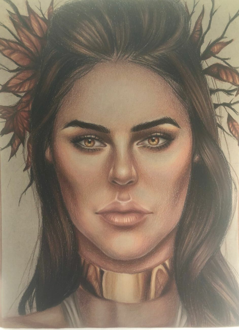
Piece #1 Self portrait
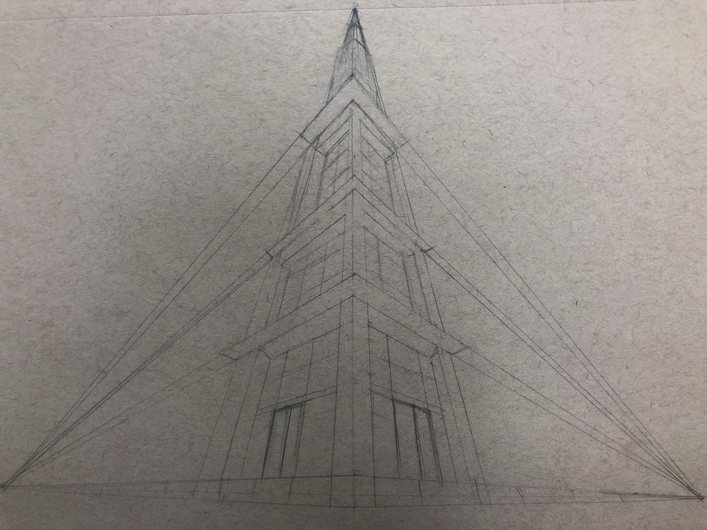
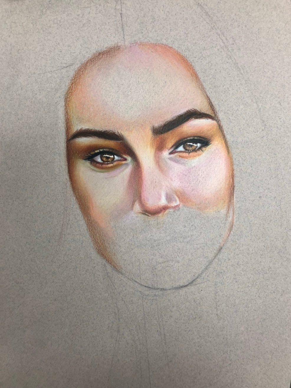
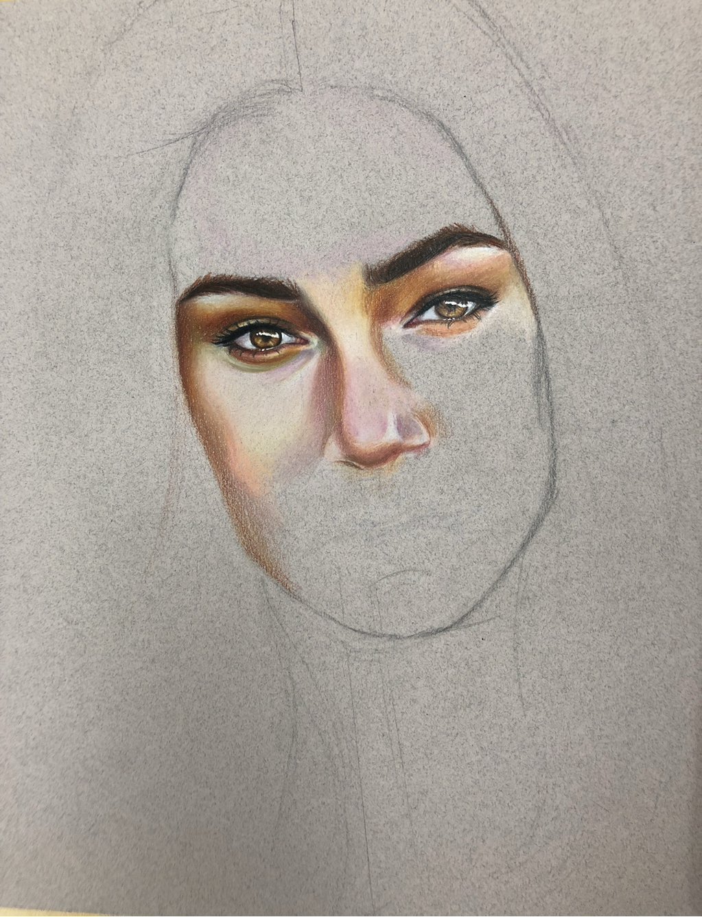
Out of all the projects I worked on this semester, my self-portrait turned out to be the most successful. To create this piece, I had to push the limits of what I know about color and the face itself. My original artistic vision was to draw a realistic self portrait but go beyond this and use an unusual color palette. I considered using a cool palette (pale blues, cool greys, whites, greens, etc.) as seen in the sketch below, and a vivid, fire-like palette. I spent extra time deciding what palette to use because I personally think deciding the tones of the skin is the most problematic thing about self-portraits. The initial sketch could be completely accurate and realistic, but this does not always result in a successful piece. This is because the colors are what establish realism and depth in a face. I think a lot of artists struggle with skin tone because it has an array of colors, ranging from warm to cool. The reference photo I chose for my portrait had dominantly warm, bright lighting. However, when I chose the colors, I considered the shadows and the cool tones that are also present in the face. Therefore, I decided to include both palettes from my initial sketch, but I leaned more towards vivid warm colors like bright oranges, yellows, and reds. This was the most creative aspect of the piece for me. I did not want to just make a self portrait, I wanted to make a statement, and I did not want to be afraid to use bold colors. Initially, I had a few ideas to incorporate flowers, neon lighting, etc. I also considered a few distorted portraits ideas, like broken shards of glass. However, I felt like these ideas made the composition of the piece unbalanced and generally too busy. In the end I went for a simplistic self portrait and let the colors speak for itself rather than trying to obscure the portrait with various objects. The main reason why I went for this idea is because the reference photo has such strong, exaggerated lighting that I felt I could create a complete piece. I also thought it was an interesting photo to use because the sunset cast interesting colors on the features of my face, which was a fun challenge to recreate in my self portrait. This challenge really pushed my limits as an artist, as I've never used a color palette so unusual. I was afraid to use highly saturated colors in the skin tone, because it didn't seem to make sense initially, because the skin tone is generally a small range of colors. Ultimately I think the final product was worth the risk. The saturated colors made the lighted/highlighted areas bright, and the shadows did not become too murky/unsaturated, as shadows can sometimes get too cool/grey when you just use browns, blacks, greys, etc. Part of the reason this blending of saturated and unsaturated, cool and warm tones was successful was because of burnishing. Burnishing colored pencils is my favorite aspect of the medium, as it creates a really smooth look. It allows me to blend unlike colors, like light peach and raw umber 50%. The most important technique I have learned for burnishing is to not burnish to early (press down on the paper initially instead of layering color first) and to blend in circular motions. Blending in circular motions gives the features of the face depth because it appears more rounded/smooth instead of appearing as noticeable pencil strokes.
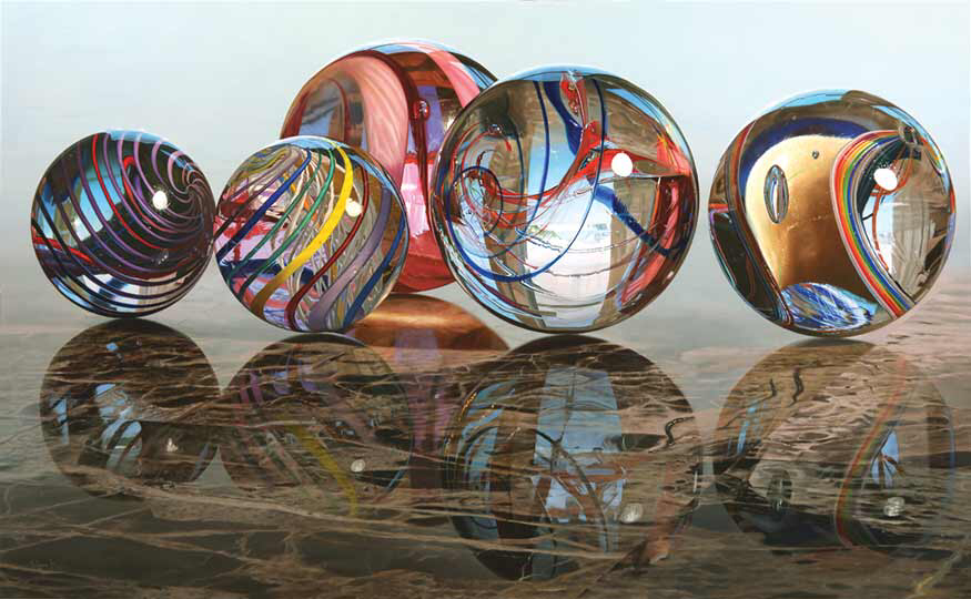
Most recent self portrait Vs. (not self) Portrait done in the fall
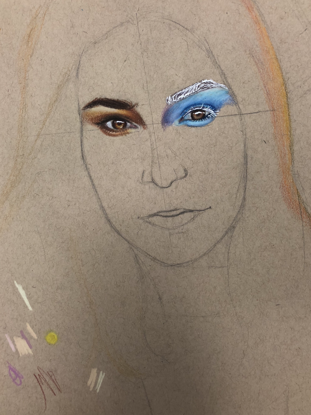
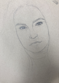
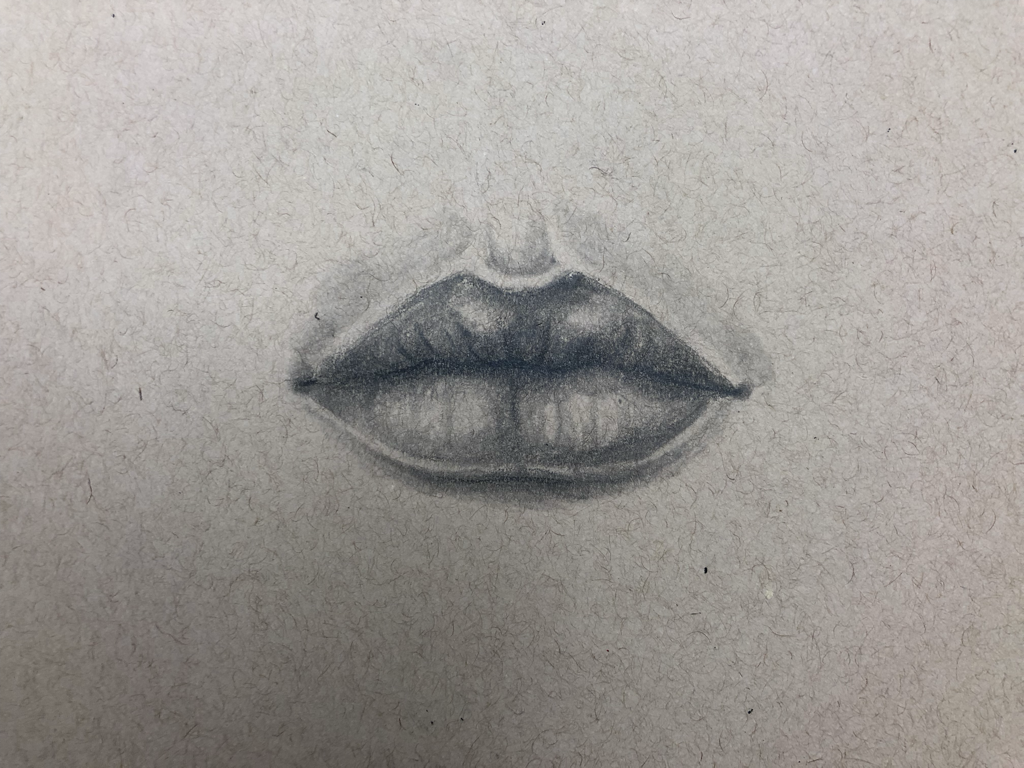
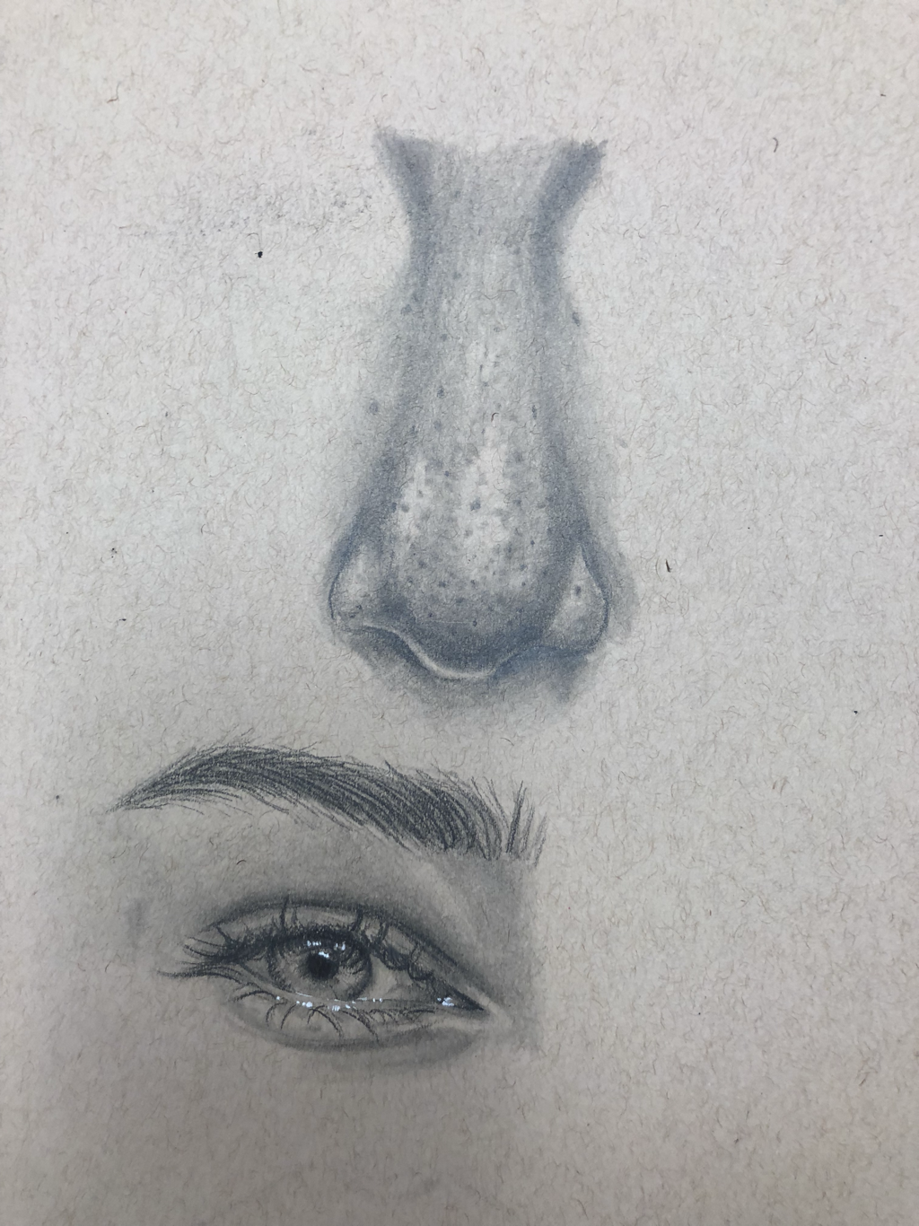
Initial sketches- self portrait
#1
1. I would describe my artistic style as semi-realism. I enjoy drawing portraits and people with a twist of my own style. To me, success as an artist is to be satisfied with a piece. Artists tend to be their own worst critic, and can often feel unsatisfied by the outcome of their artwork. Therefore, I think a piece can we weighed on how successful it is by how satisfied an artist is when analyzing the outcome of their piece. This also leads to what I think is most rewarding about being an artist. Art is a personal journey, and the most rewarding part about being an artist is when you feel accomplished with how far you've progressed and how your skills have improved. When I work on a piece, the most important skills I draw upon are my ability to be inspired by surroundings (music, environment, etc.) and my eye for unlikely colors. Contrast between colors creates depth, and I use that to make my pieces stand out. One of the most significant things I have learned through art making is persistence. Often I feel frustrated when a work is in its initial stages, and I want to abandon the piece because I feel like it could be done better. A lesson I had to learn was that when you persevere through the rough stages of a piece, the outcome can be amazing. Refining a piece can only come after the base is done, and it's important to not give up halfway. Another important thing I have learned through art-making is perspective. When drawing, what you think you've drawn and what you've actually drawn can be totally different. It's important to take a step back and analyze your work as you go, because your perspective changes. You see the piece as a whole rather than close up as you work.
#2
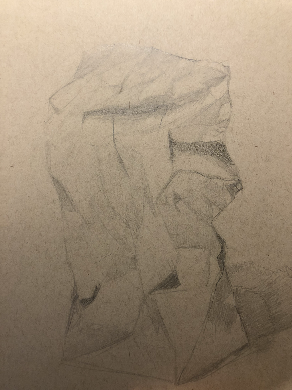
2. Two pieces that show my improvement as an artist are the paper bag value drawing and my most recent piece, the self portrait. The paper bag piece was done at the beginning of the semester; we had to draw a paper bag in full value using a physical reference in exaggerated lighting. While this was only done in graphite, I think it lacked a full range of value. It was hard to distinguish the creases in the bag from the lighted areas. I tried to consider using a full range of graphite pencils to create the look, however it just came out very harsh in some areas and then too light and not visible in others. However, I did understand that the portions that were closest to the light source would be illuminated the most, and the inward creases would feature various shadows. I think the lack of depth was a result of my inexperience with graphite pencils. I would like to experiment with them more in the future, focusing on really bringing out the depth in a still life piece. I think my self-portrait was more successful in establishing values and the depth of the face. The two pieces can be compared because both had strong light sources. I used wax-based colored pencils for this piece, which I am more familiar with. With my knowledge of color theory, I think the colors helped establish values. Burnishing dark reds and browns into light peaches and pinks create an interesting contrast and catches the attention of the eye, which helps distinguish the hollows of the cheeks, curves of the nose, roundness of the forehead, etc. The values in this piece were more obvious, and the transitions between values seem more obvious so it doesn't look as harsh. I used burnishing to accomplish this smooth transition. The light source of the piece was also more obvious in my self portrait. A technique I used that helped me improve in my self portrait was to step back and examine my progress. I broke down the piece into simple shapes with simple values, and combined them together to create depth in the face. For this piece, I wanted to really emphasize the different colors in the reference photo; bright reds, oranges, yellows, and pinks, as well as a mix of raw umbers, burnt siennas, browns, etc. When I finish the piece, I would also like to add blues in the shadows and reflected light to add an extra touch of realism
#6
6. The medium I enjoyed working with the most was the Prismacolor colored pencils. You have more control over the medium with colored pencil, and for me especially I struggle with other mediums because of their ability to smudge (I'm left handed). Pastels smear easily and lose their saturation, paint gets on the side of my hand, and graphite darkens the entire page and my hand by the time I'm done with a piece. Since the colored pencils are wax-based, they won't smudge. Because they are wax-based, they blend really smoothly. Burnishing is the most important technique I have learned when using colored pencils as my preferred medium. Burnishing refers to the layering colors and blending until the tooth/rough texture of the paper no longer shows. Not only does this make the drawing look more smooth, but it adds more realism since there's no grain. I was able to master this technique through practice. When you burnish too quickly, or press down on the paper too early in the drawing, the paper won't take any more wax and you can't build any more color. I know I have personally struggled a lot with this, because I'm impatient. It is important to slowly build up layers of color and then burnish it. I think by the end of the semester, I accomplished this in my self portrait. Additionally, I think colored pencils can really bring out the saturation of a color, allowing for elaborately colorful pieces. This inspires me to draw more abstractly, explore different color palettes, and generally inspires me to not be afraid of going bolder and brighter.
#7
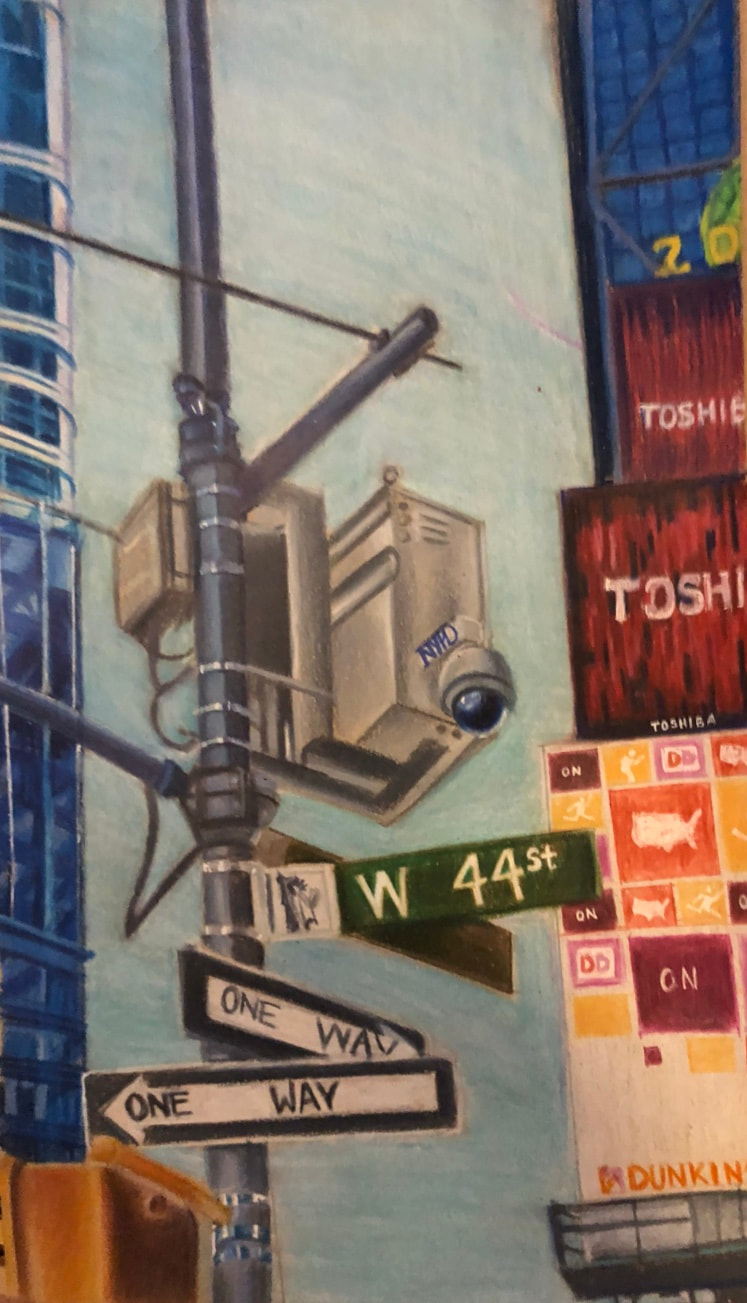
7. One project I think was not successful whatsoever was my perspective piece. My initial sketch was not really in one-point perspective, as I used a reference I took last summer and hastily sketched it out, but I didn't really apply the techniques learned in class. Therefore, the perspective was off. The photo I chose was taken in Times Square, with a light post in the foreground as the main point of interest. I thought the picture would be interesting to create with colored pencil, however I've never actually done a landscape piece before, especially with buildings. The buildings were not in the same perspective, so it was overall unrealistic and I couldn't convey the scene as I had envisioned in my mind. Aside from that, I think that I chose the wrong medium. I really wanted to use colored pencils because it's the medium I'm most comfortable with, and I felt like the usage of color would create that necessary depth to establish what was going on in the drawing. However, the colored pencils I used, Caran D'ache Luminance wax-based colored pencils, are not made for insane detail, like the detail you would find in a cityscape. If I used prismacolors, I feel like I could've been more successful in adding the details. In the end, the details just got really lost. Additionally, the colors I chose needed to be unified with some kind of tone to them (warm, cool, etc). I rushed the piece and I threw in colors that didn't really make sense together, so overall the components of the piece just didn't seem to go together. In my haste I also burnished the background without layering up the colors first, which resulted in an unappealing and not smooth look. If I took my time, I feel like the outcome of the piece could have looked a lot better, but I also don't regret finishing this piece, because I learned from my mistakes. I think this is a big step towards improving as an artist, and I look forward to doing more environment drawings in the future.
Unsuccessful perspective vs. successful pespective